Darren Trautwein
Digital Consumer Experience Design and Product Leader with deep expertise creating human-centered digital products, platforms, and connected ecosystems within complex global organizations. Extensive pharmaceutical and healthcare experience, including building Merck’s first U.S. digital UX practice and scaling it into a global capability supporting platforms across 140+ markets. Proven ability to lead across the full product lifecycle—from discovery, research, problem framing, and ideation through prototyping, validation, implementation, measurement, and optimization.Skilled at translating complex scientific, healthcare, technical, and enterprise workflows into intuitive experiences that reduce cognitive load and operational friction without reducing capability. Experienced designing for consumers, scientists, technical professionals, and enterprise users while partnering across Product, Engineering, Research, Data Science, Marketing, Legal, Compliance, Brand, and business leadership to transform user insights into experience strategy, scalable design systems, product roadmaps, and measurable outcomes.
MerckEngage
MM&M awarded patient engagement ecosystem for patients, caregivers and HCPs
Heartery
AI-driven hypertension management and responsible health intelligence
Toujeo
Diabetes treatment ecosystem for patients and healthcare professionals
RxNetwork
Medication adherence through behavioral design, rewards and pharmacy integration
YOO Challenge
Gamified fitness experience connecting wearable technology and behavior change
Merck GMAX Affordability
Using Design Thinking to Evaluate and Implement Affordability Solutions Across Diverse Markets
Additional Product Experiences
Digital product experiences highlighting the problems addressed, solutions delivered, and experiences
Get in touch.
Shaping connected experiences that elevate humanity—driving a global design dialogue bold enough to transform organizations, inspire progress, and spark the future.
MerckEngage
Client: Merck
Role: VP, UX & Digital Innovation
Category: Healthcare / Pharmaceutical
Experience: UX Strategy • Human-Centered Design • Research • Information Architecture • Interaction Design • Product Design • Usability Testing • Personalization • Digital Health
01 — The Challenge
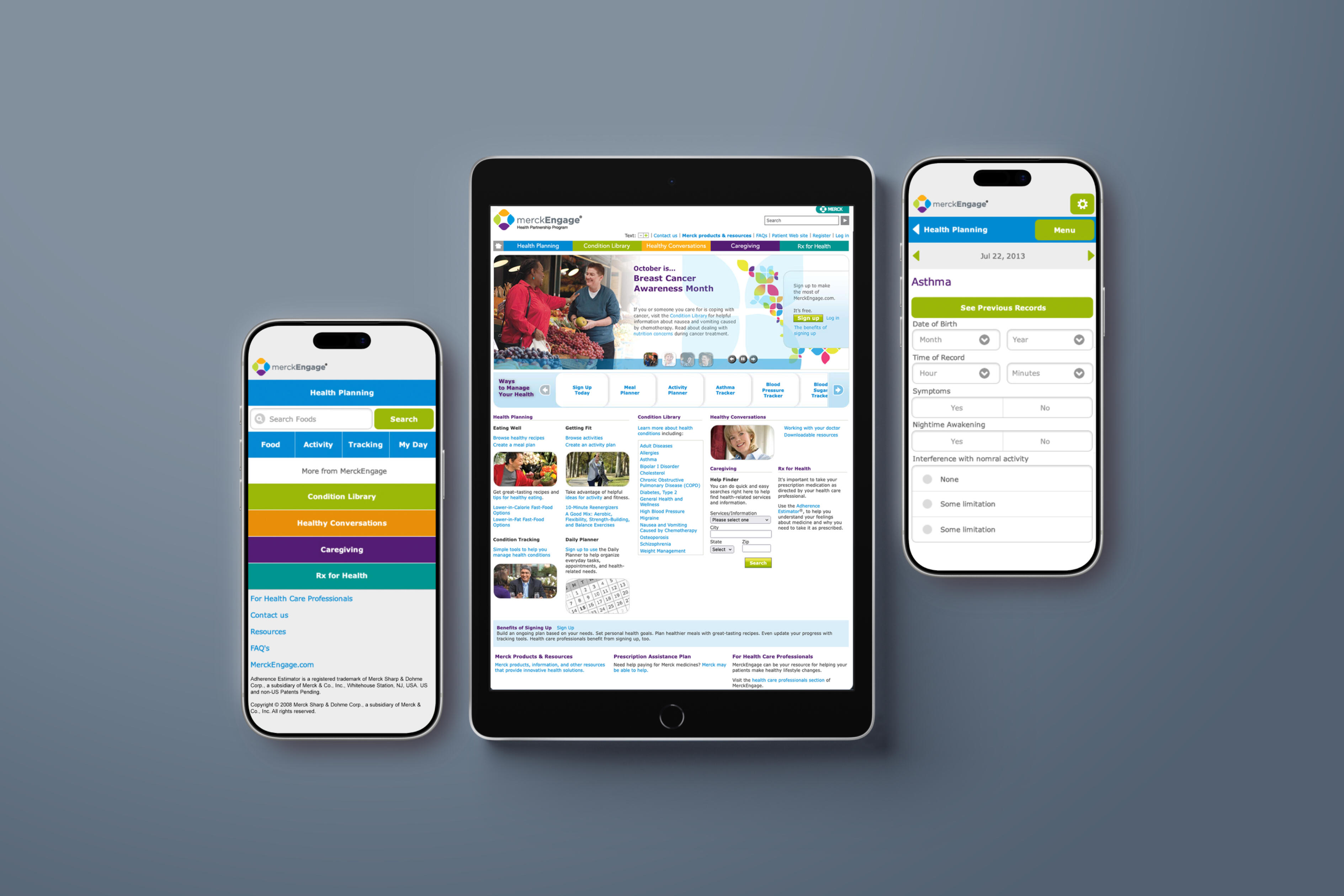
Transforming fragmented patient support into a connected healthcare experience.Patients do not experience healthcare as a single interaction. Their journey can involve learning about a condition, beginning treatment, understanding medication, managing schedules, communicating with caregivers and healthcare professionals, finding support, and maintaining healthy behaviors over time.MerckEngage represented an opportunity to bring those experiences together within a unified digital ecosystem. The challenge was to create an experience capable of serving three very different audiences—patients, caregivers, and healthcare professionals—while making a complex healthcare environment feel simple, relevant, trustworthy, and accessible.The experience also needed to support business objectives around new patient starts, engagement, adherence, and long-term loyalty while maintaining the privacy and trust required of a healthcare platform.
02 — Discover
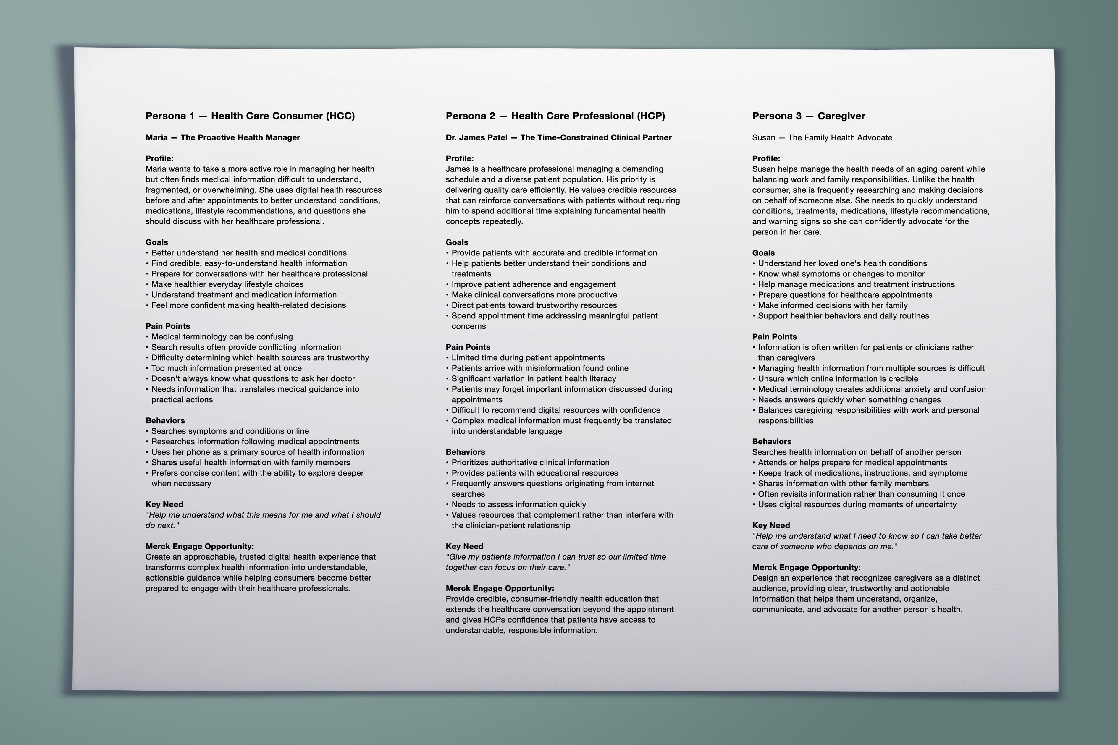
Understand the people behind the healthcare journey.The process began by framing the experience around the needs of the people using it rather than around Merck’s organizational structure.Patients needed understandable health information, medication support, progress visibility, relevant resources, and confidence that their information was protected. Caregivers needed visibility into the people they were supporting and tools that helped them participate without unnecessarily increasing complexity. Healthcare professionals needed efficient access to relevant patient information and ways to support patient progress.This established an important UX principle: one ecosystem could not mean one identical experience. The platform needed a shared foundation with experiences that adapted according to role, context, needs, and permissions.
03 — Define
Turn user needs into experience principles.The problem was reframed from “How do we create a healthcare website?” to “How do we create an ongoing digital relationship that helps people navigate their health journey?” That distinction changed the product strategy.Rather than organizing the experience around individual Merck programs or services, the UX needed to connect capabilities around the user’s needs.• Simple — Reduce friction around registration, navigation, and common healthcare tasks.
• Personal — Make information and services relevant to the user’s role and needs.
• Trustworthy — Make privacy, permissions, authentication, and data use understandable.
• Supportive — Help users know what to do next rather than simply presenting information.
• Connected — Bring health information, medication support, progress, offers, and assistance into a coherent ecosystem.
• Accessible — Support users with different
04 — Map the Experience
Reduce friction at the moments where trust matters most.Healthcare UX presents a particular challenge: users may already be dealing with uncertainty, unfamiliar terminology, or complex treatment decisions. The interface therefore needed to minimize unnecessary cognitive effort.Onboarding became the beginning of personalization rather than simply an administrative requirement.Identify User → Establish Role → Create Profile → Establish Permissions → Capture Preferences → Personalize Experience
05 — Information Architecture
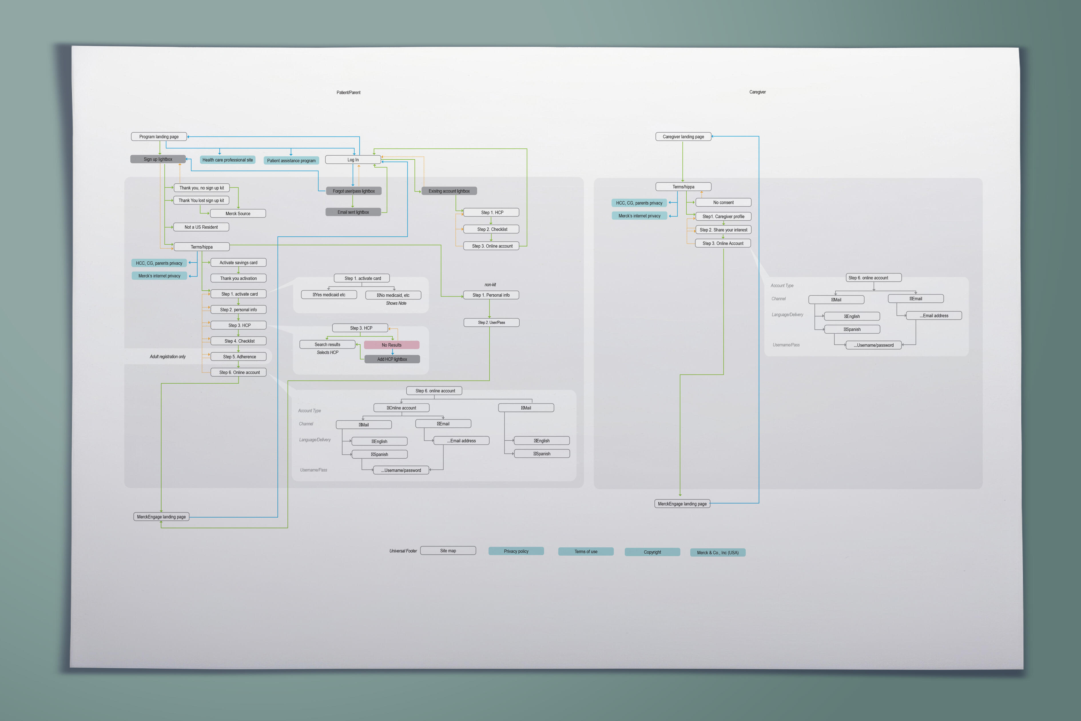
Create one ecosystem for multiple audiences.The product architecture was structured around the tasks users were trying to accomplish rather than around internal organizational ownership.• Profile & Preferences — personal information, user role, communication preferences, permissions and privacy.
• Health Dashboard — centralized access to health information, medication schedules, progress, activities and updates.
• Medication & Condition Support— resources and tools associated with treatment and ongoing health management.
• Programs & Offers — incentives, programs and offer redemption designed to encourage engagement and healthy behaviors.
• Caregiver & HCP Support — role-specific tools allowing appropriate monitoring and collaboration.
• Help & Coaching — troubleshooting, support resources and coaching interactions.

06 — Interaction Design
Reduce friction at the moments where trust matters most.Healthcare UX presents a particular challenge: users may already be dealing with uncertainty, unfamiliar terminology, or complex treatment decisions. The interface therefore needed to minimize unnecessary cognitive effort.Onboarding became the beginning of personalization rather than simply an administrative requirement.Identify User → Establish Role → Create Profile → Establish Permissions → Capture Preferences → Personalize Experience
07 — Personalization
Make a large healthcare ecosystem feel individually relevant.Personalization was fundamental to the experience rather than an additional feature. The platform could adapt according to the user’s role, health needs, participation, preferences and permissions.Instead of forcing users to search through a large healthcare ecosystem, MerckEngage could surface information and functionality relevant to the individual.
08 — Inclusive & Accessible Experience
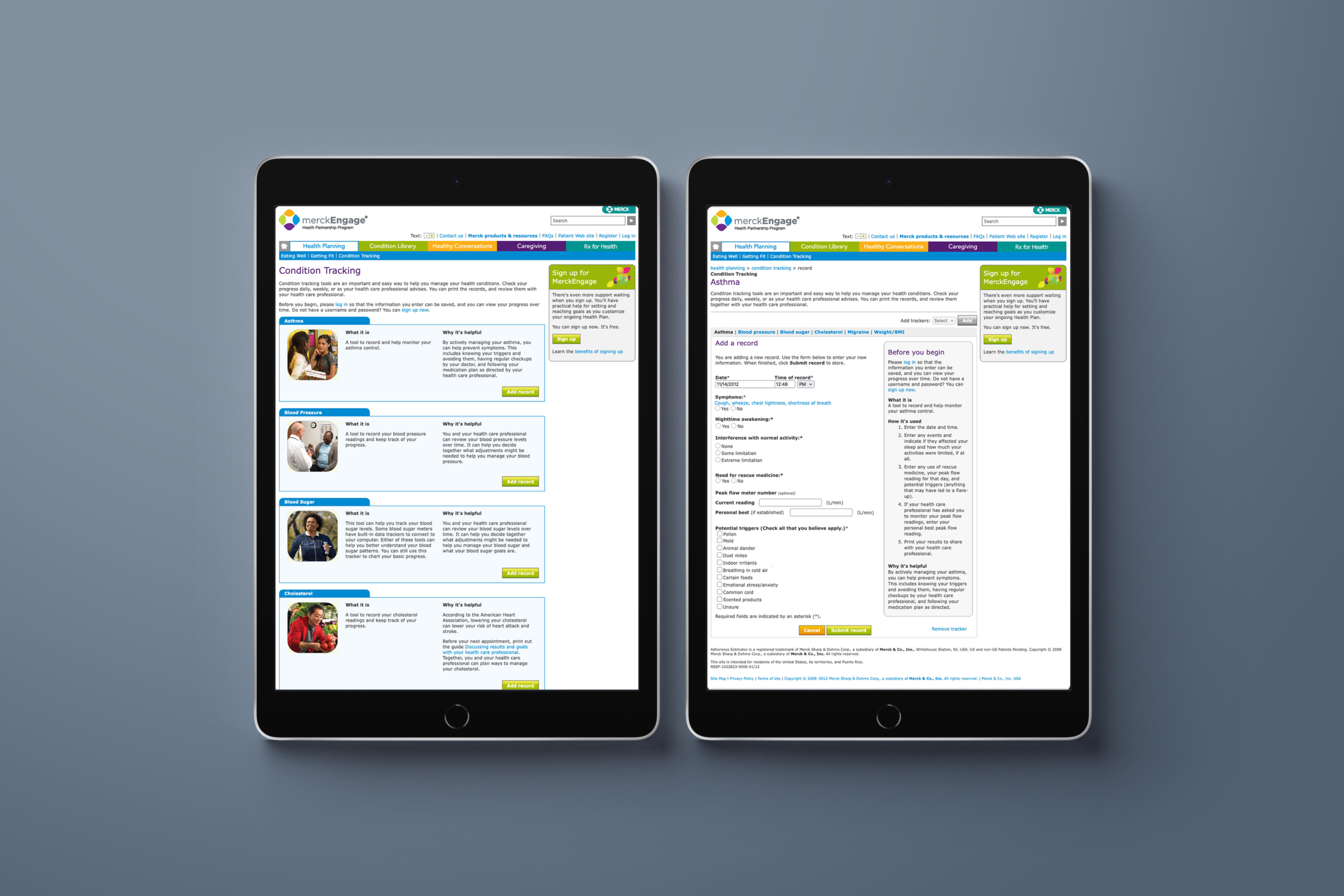
Design for healthcare’s real audience—not an idealized user.Healthcare audiences vary significantly in age, ability, language, cultural background, digital confidence and health literacy. MerckEngage incorporated multilingual and multicultural support within the broader engagement strategy.Accessibility was treated as a requirement for healthcare UX rather than a feature.
09 — Prototype, Test & Learn
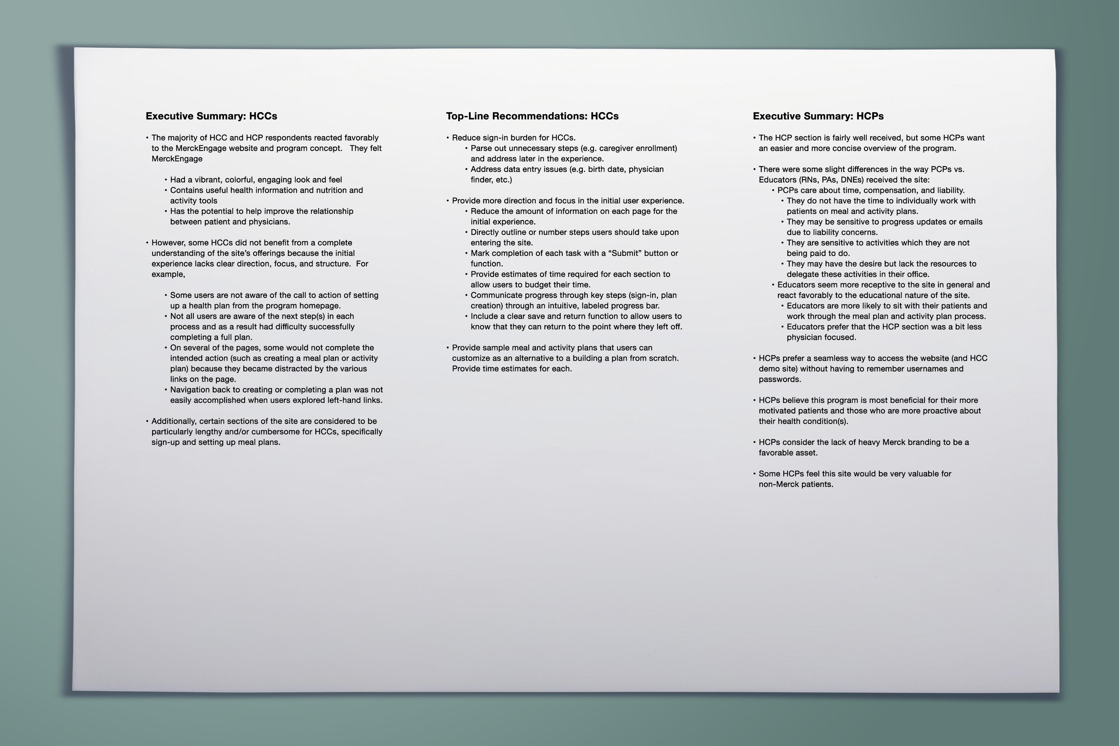
Treat design as a hypothesis—not an answer.The experience was developed iteratively. Design concepts and workflows were evaluated and refined through usability testing, user feedback and analytics-driven optimization.Design → Prototype → Test → Learn → Refine → Measure → Repeat
10 — From UX to Product Ecosystem
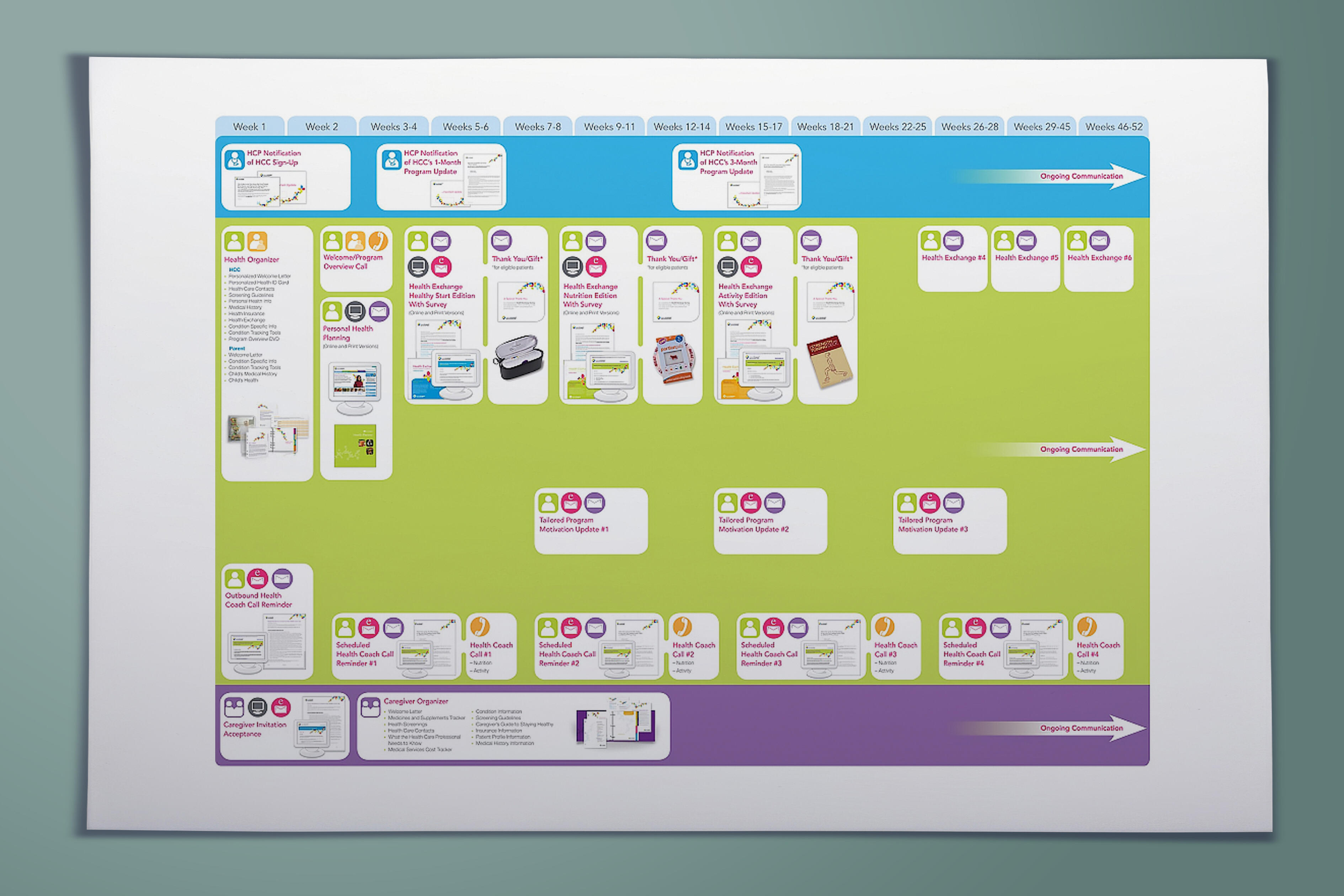
Connect individual interactions into a continuous relationship.The final experience connected onboarding, profiles, personalization, dashboards, health information, medication support, progress, offers, loyalty, coaching and support into one health engagement ecosystem.The value was not simply designing better screens. It was creating an experience architecture capable of connecting patients, caregivers, healthcare professionals, services, information and support across an ongoing healthcare journey.
11 — Outcome
A Best-in-Class Health Engagement Platform.MerckEngage scaled to millions of users across patients, caregivers and healthcare professionals while using personalized experiences and privacy capabilities to strengthen trust and loyalty.The work received MM&M recognition for Best Online Patient Relationship/Support Program and Best Interactive Initiative for Consumers.The platform demonstrated how human-centered design could connect user needs and organizational objectives across patient value, caregiver value, HCP value and Merck business value.

Understand the journey. Reduce the complexity. Design around the person.
MerckEngage transformed a collection of healthcare services into a more connected digital experience by placing the needs of patients, caregivers, and healthcare professionals at the center of the product strategy. Through role-based experiences, personalization, thoughtful information architecture, iterative testing and continuous optimization, the platform demonstrated that healthcare UX is not simply about making complex systems easier to use—it is about making healthcare easier to navigate.
HEARTERY
Client: Heartery
Role: UX / Product Design Leadership
Category: Digital Health / Hypertension / AI
Experience: UX Strategy • Human-Centered Design • Product Design • AI Experience Design • Health Data Visualization • Interaction Design • Usability Testing • Personalization • Privacy & Compliance
01 — The Challenge
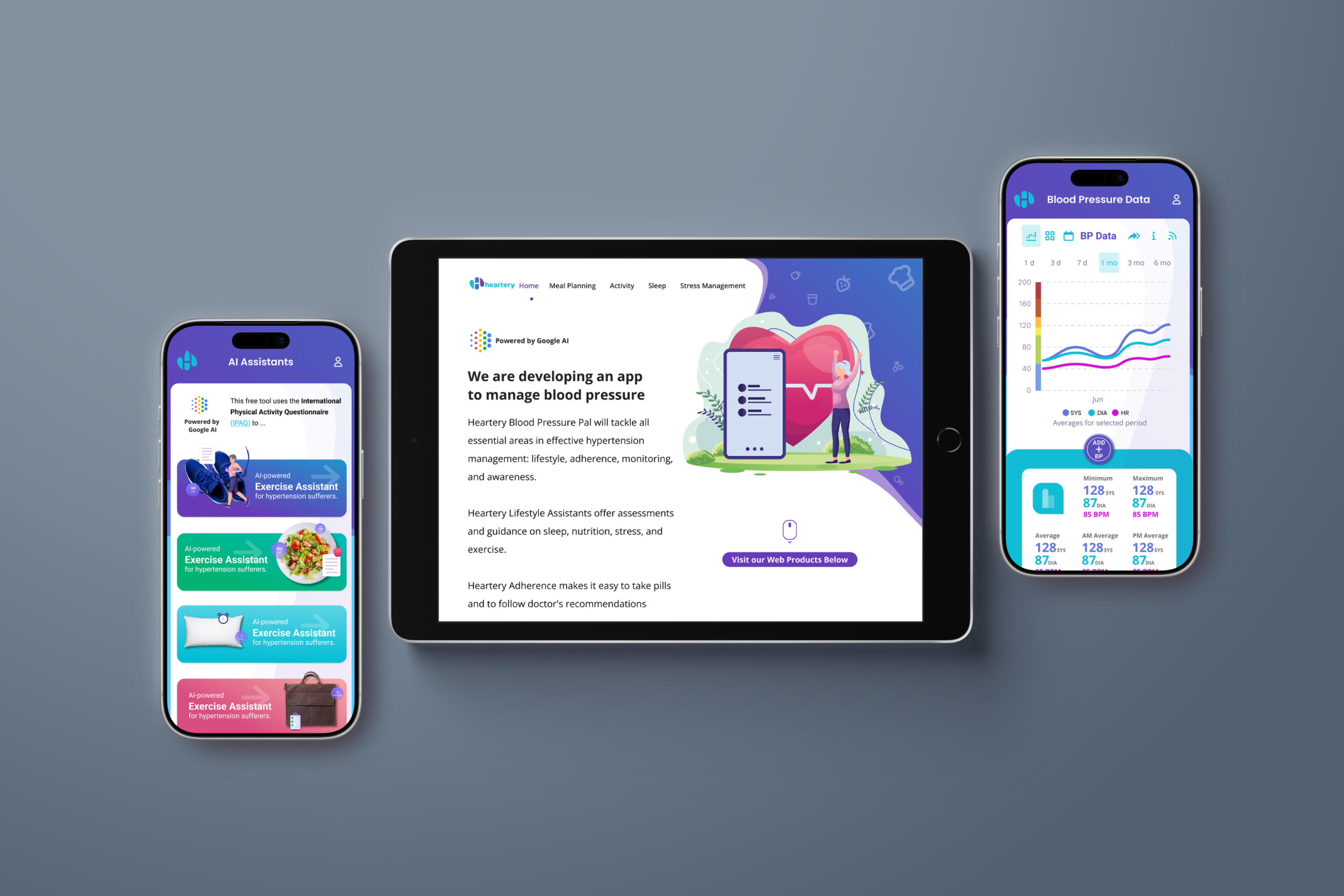
Turn complex health data into decisions people can actually use.Managing hypertension can require people to continuously navigate multiple interconnected behaviors: monitoring blood pressure, understanding symptoms, taking medication correctly, recognizing potential side effects, adjusting diet and activity, and knowing when something may require additional attention.Heartery needed to bring those activities together within one digital experience without making the user feel as though they were managing a clinical system. The platform also needed to maintain strict privacy and security expectations while introducing AI-generated insights into a highly sensitive healthcare environment.The UX challenge became: how do we make sophisticated health intelligence feel simple enough to become part of someone’s everyday routine?
02 — Discover
Understand the realities of managing hypertension every day.The experience needed to begin with the user’s lived problem—not with the AI. A person managing hypertension may be asking what their blood pressure is doing, whether a reading is unusual, whether they took medication, whether a symptom is related to treatment, or what changes they should make in diet and activity.The key product principle was that users should not have to assemble the story themselves from disconnected health data.
03 — Define
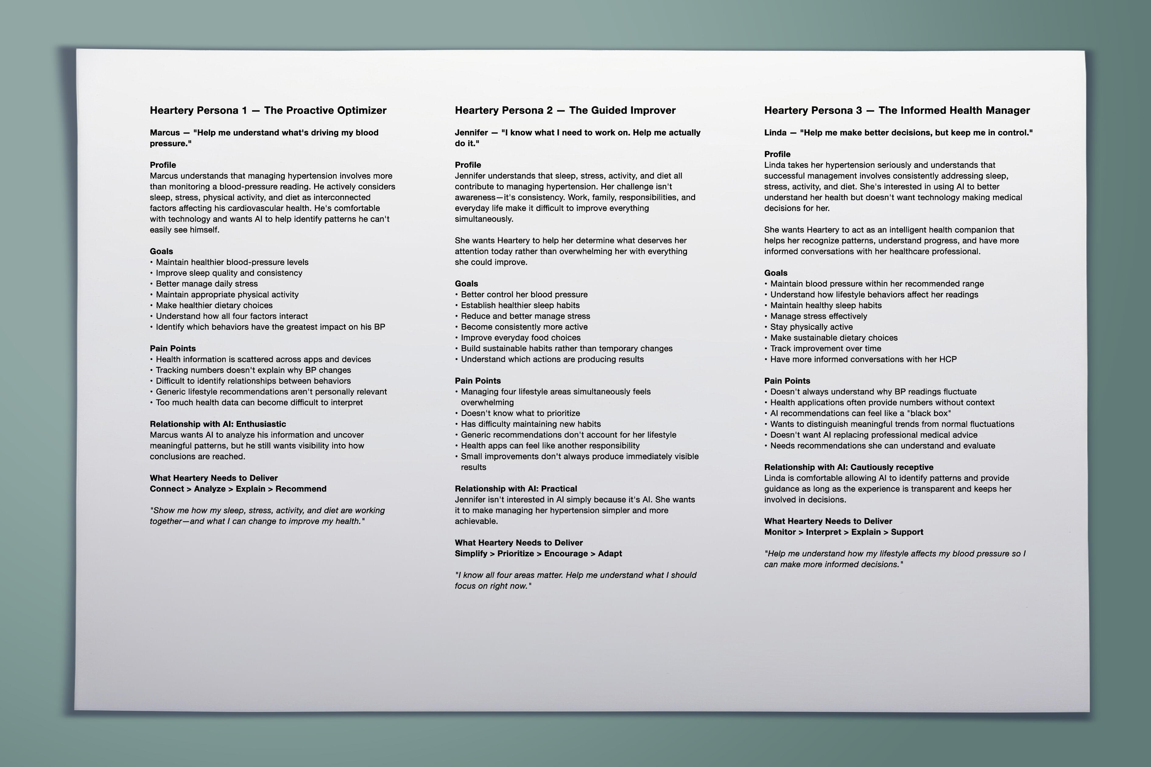
Reframe the product from health tracking to health understanding.Many digital health products stop at measurement. Heartery needed to move from “Here is your data” toward “Here is what your data may mean and what you can do with it.”• Clear — Health data should be understandable without requiring clinical expertise.
• Actionable — Insights should lead naturally toward appropriate next actions.
• Personal — Guidance should reflect the individual’s health information and behavior.
• Reassuring, not alarming — Alerts should communicate importance without unnecessary anxiety.
• Trustworthy — Users should understand how sensitive data and AI are being used.
• Low-friction — Health management should fit into everyday routines.
04 — Map the Health Journey
Design around an ongoing management cycle, not isolated screens.Hypertension management is continuous, so the product journey needed to reflect a recurring cycle across blood pressure, medication, symptoms and lifestyle.Monitor → Understand → Act → Track → Adjust → Repeat
05 — Information Architecture
[Bring fragmented health behaviors into one understandable system.The architecture organized the experience around the things users needed to manage most often.• Dashboard — current health status, trends, alerts and next actions.
• Blood Pressure — readings, historical trends and abnormal-pattern visibility.
• Medications — schedules, reminders, adherence and side-effect tracking.
• Lifestyle — dietary recommendations, activity guidance and stress-management support.
• AI Insights — personalized observations, alerts and recommendations.
• Progress — longer-term trends that show change over time.]{#00aeef}

06 — Dashboard & Data Visualization
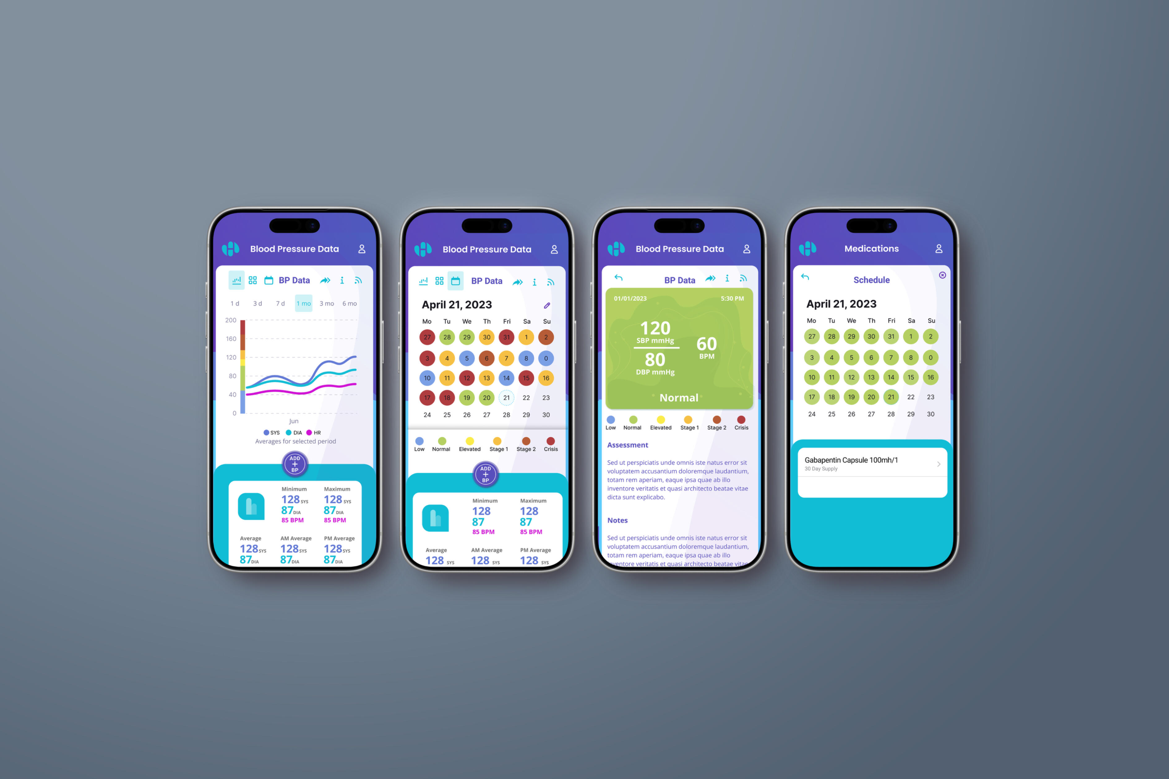
Answer the question: “How am I doing?”The dashboard needed to prioritize comprehension over data density. The hierarchy focused on current status, trend, concern and action.The visual model progressively revealed information from status to insight to supporting data to detail. The design challenge was not simply visualizing blood pressure—it was visualizing significance.
07 — AI Experience Design
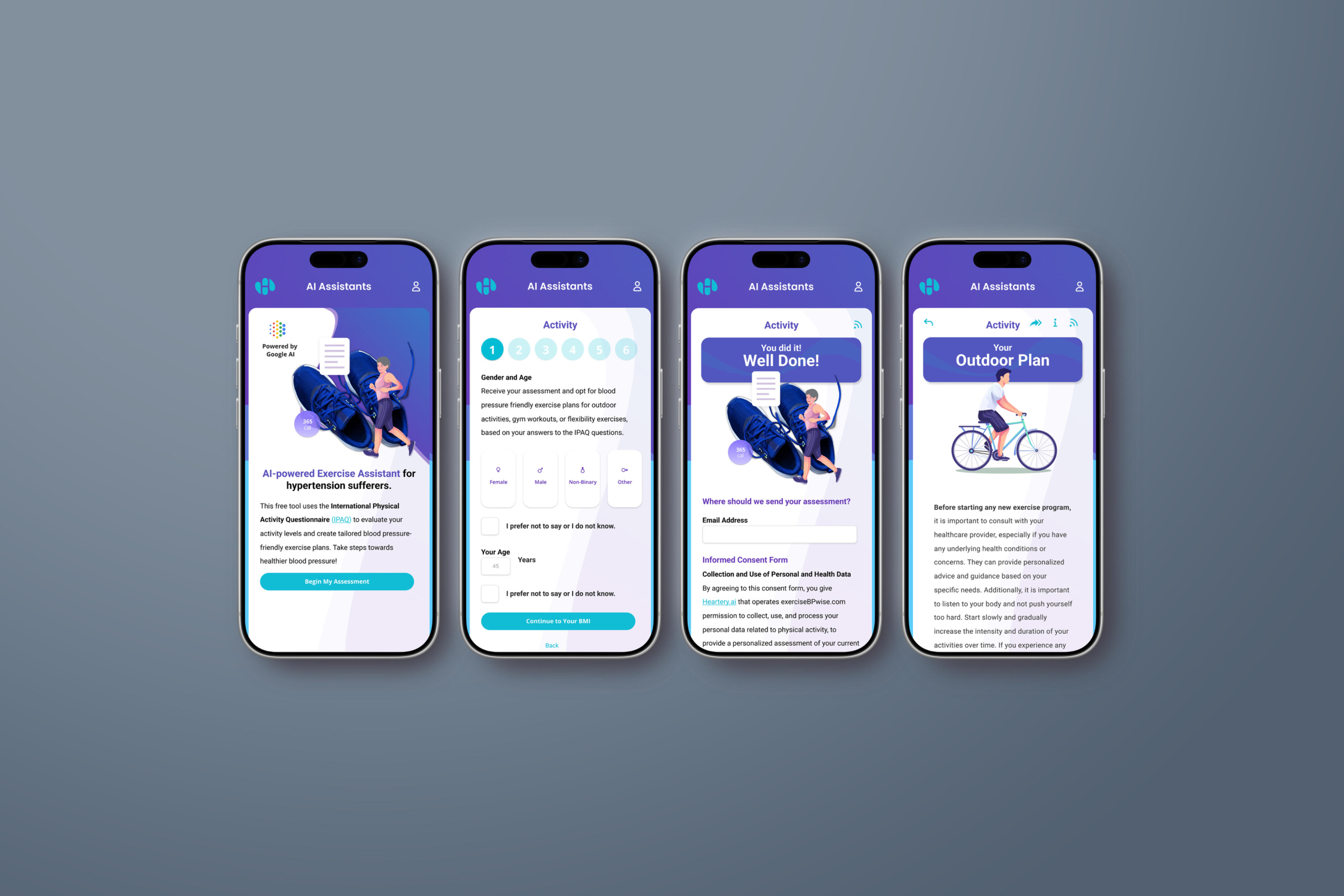
Make the intelligence visible without making the technology the experience.The platform generated personalized health insights, real-time alerts for abnormal blood-pressure trends, medication-adherence reminders and tailored lifestyle recommendations.The UX translated machine intelligence into a simple interaction pattern and explained what mattered before explaining how the system discovered it.Health Data → Pattern → Insight → Explanation → Suggested Action
08 — Personalization
Move from generic health advice to relevant guidance.Personalization could connect blood-pressure history, medication adherence, symptoms, lifestyle behavior and observed trends to create more relevant recommendations.The experience moved from generic advice toward guidance grounded in what the system was seeing in the individual’s health information.
09 — Medication Experience
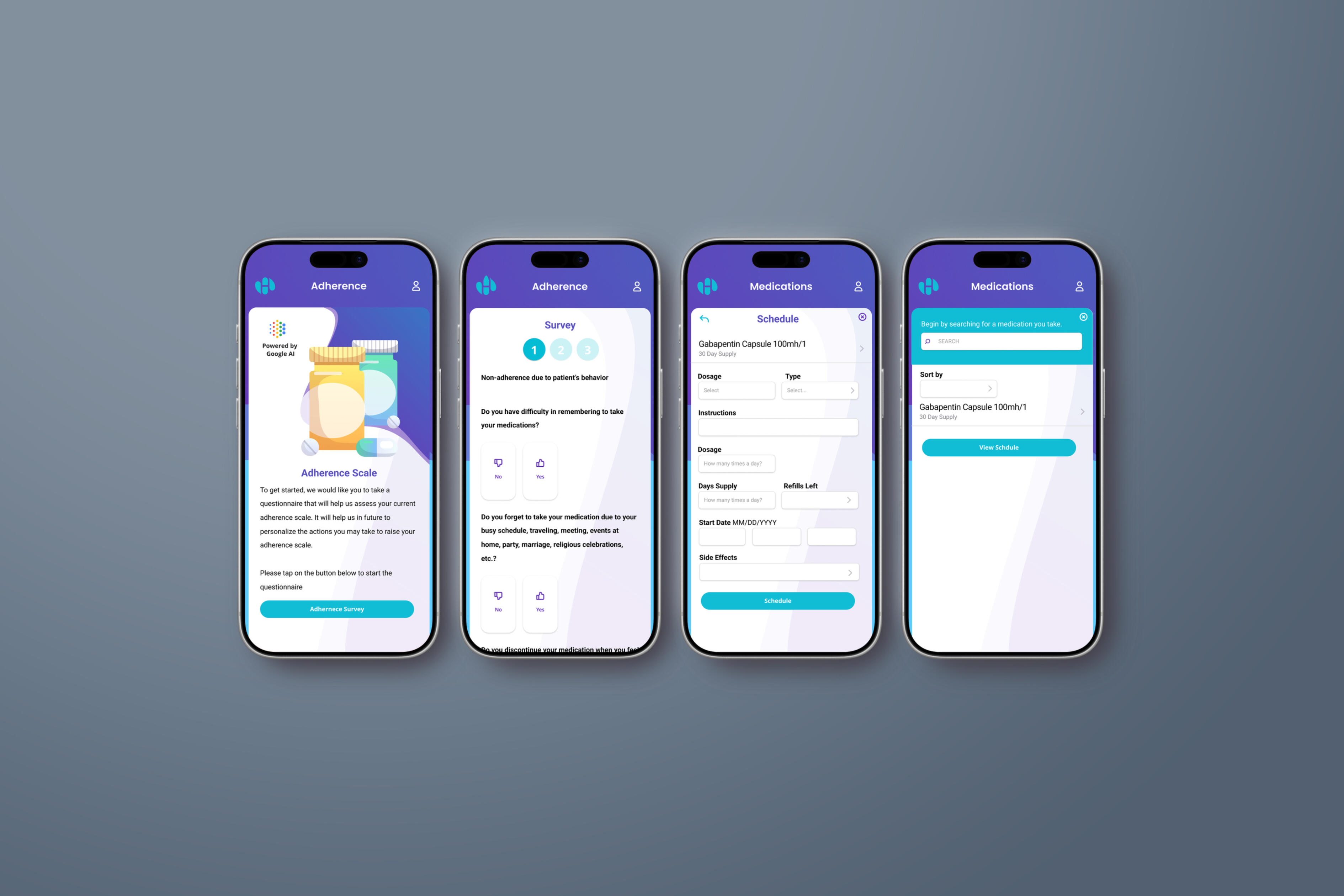
Support adherence without turning medication into another administrative task.The medication journey supported schedules, reminders, adherence history, potential side effects and appropriate guidance while connecting treatment behavior to health outcomes.Schedule → Reminder → Confirmation → Adherence History → Potential Side Effect → Guidance
10 — Trust, Privacy & Responsible AI
Trust is part of the interface.Heartery needed to satisfy HIPAA, GDPR and EU AI Act requirements while using secure architecture and transparent practices. Privacy could not live only in legal documentation; it needed to be communicated through permissions, data use, authentication, understandable AI recommendations and appropriate user control.
11 — Integration With the Health Ecosystem
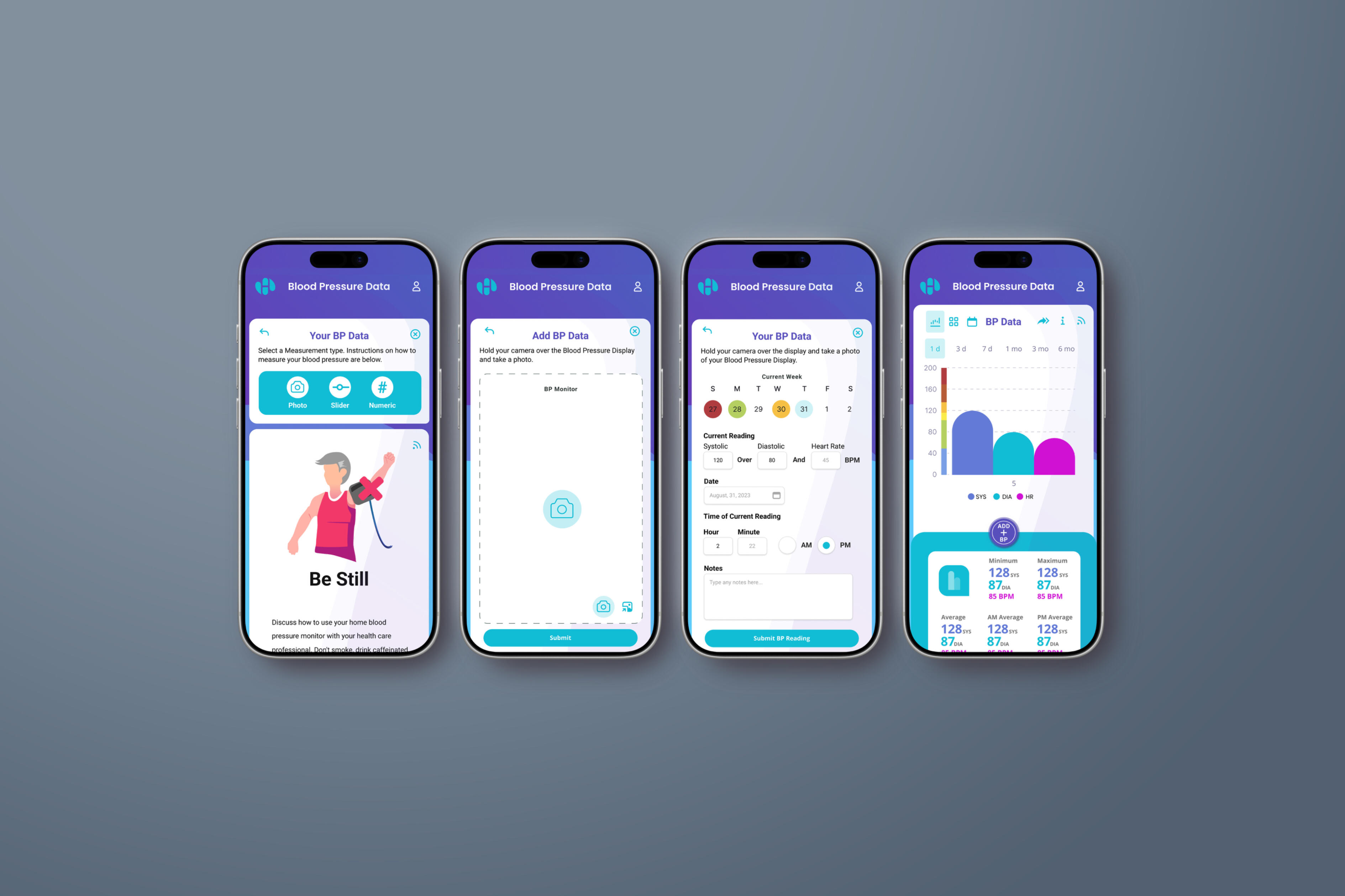
Do not make users manually recreate health data that already exists elsewhere.Heartery was designed to integrate with blood-pressure monitors and third-party health applications. From a UX perspective, every manual action adds friction.The ideal flow becomes measure, sync, understand—rather than measure, remember, open an app and manually enter data.Measure → Sync → Understand
12 — Prototype, Test & Validate
Validate the experience and the intelligence behind it.Testing included incremental usability testing, algorithm validation and compliance audits. This created multiple validation layers across usability, comprehension, technical validation, trust and safety, and compliance.Design → Prototype → Test → Validate → Refine → Measure → Repeat
13 — Design for Continuous Improvement
Health management changes. The experience has to change with it.The platform was not designed as a static release. Incremental testing allowed assumptions about user behavior and AI performance to be continuously evaluated and refined.Measure → Learn → Improve → Validate → Scale
14 — Future Experience Opportunities
The architecture established a foundation for expansion into wearable integration, predictive analytics for early hypertension detection and telehealth capabilities.The UX foundation could support the evolution from monitoring to prediction, intervention, connection and ongoing management without forcing users to relearn the product.Monitor → Predict → Intervene → Connect → Manage
15 — Outcome
A Scalable, Human-Centered Health Management Experience.Heartery combined personalized health guidance, medication support, blood-pressure monitoring, lifestyle recommendations, privacy controls and connected health technology within a unified experience.The value spanned user value through reduced complexity, clinical experience value through trend visibility, product value through a scalable connected platform, and business value through differentiation based on AI, personalization, compliance and human-centered design.
Simplify the data. Explain the meaning. Help people know what to do next.
Heartery demonstrates that designing an AI-powered healthcare product is not primarily about putting artificial intelligence into an interface. It is about using intelligence to remove complexity. By connecting monitoring, medication, lifestyle, personalized guidance, data visualization and responsible AI within one human-centered experience, Heartery turned fragmented health information into understanding that can lead to action.
TOUJEO
Client: Sanofi
Product: Toujeo®
Role: UX / Experience Design Consultant
Category: Pharmaceutical / Diabetes Care
Experience: Patient & Healthcare Professional Digital Experience, UX Strategy • Human-Centered Design • Journey Design • Behavioral Design

01 — The Challenge
Toujeo needed to communicate complex diabetes treatment information to two audiences with fundamentally different needs: patients managing diabetes and healthcare professionals making and supporting treatment decisions.Patients needed an experience that made treatment information approachable, understandable, and actionable while providing clear access to education, administration guidance, savings, and support.Healthcare professionals required a more clinically focused experience that enabled them to quickly access product information, clinical evidence, dosing and administration guidance, safety information, and patient-support resources.The challenge was to redesign both experiences around the needs of their respective users while maintaining a cohesive Toujeo brand ecosystem and working within the content, medical, legal, and regulatory requirements of a pharmaceutical product.
02 — Discover
The process began by understanding the different contexts in which patients and healthcare professionals interacted with Toujeo.For patients, the experience needed to account for varying levels of diabetes knowledge, treatment familiarity, health literacy, and comfort with insulin therapy.
For healthcare professionals, the experience needed to support efficient information retrieval and provide clear pathways to the clinical information necessary to evaluate and discuss treatment.This established a fundamental UX principle:The same treatment required two very different digital experiences.
03 — Define
The experience was defined around the primary needs of each audience.PatientUnderstand → Learn → Prepare → Use → Get SupportThe patient experience needed to help users understand Toujeo, learn about treatment, prepare for conversations with their healthcare provider, understand administration, and access ongoing support.Healthcare ProfessionalEvaluate → Validate → Prescribe → Educate → SupportThe HCP experience needed to help clinicians efficiently evaluate Toujeo, review supporting information, understand dosing and administration, and access resources for supporting patients.
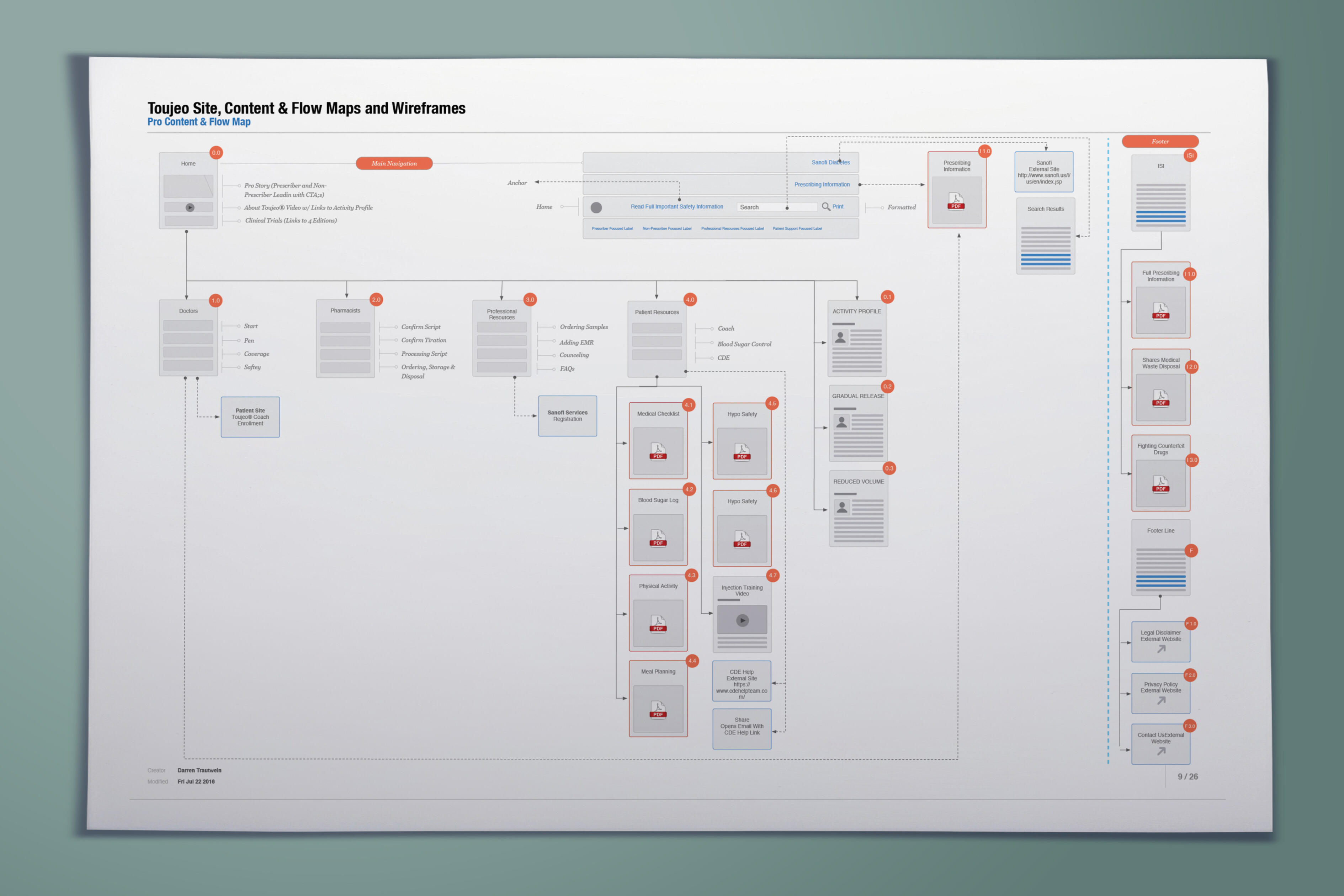
04 — Map the Patient & HCP Journeys
Rather than creating two variations of the same website, I mapped the experiences around the questions each audience was trying to answer.HCP Journey
Why Toujeo?
↓
What does the clinical evidence show?
↓
Which patients should I consider?
↓
How is it dosed and administered?
↓
How can I support my patients?
Patient Journey
What is Toujeo?
↓
Why might it be appropriate for me?
↓
What should I know before starting?
↓
How do I use it?
↓
What support is available?Mapping these journeys established the foundation for the information architecture of both experiences.
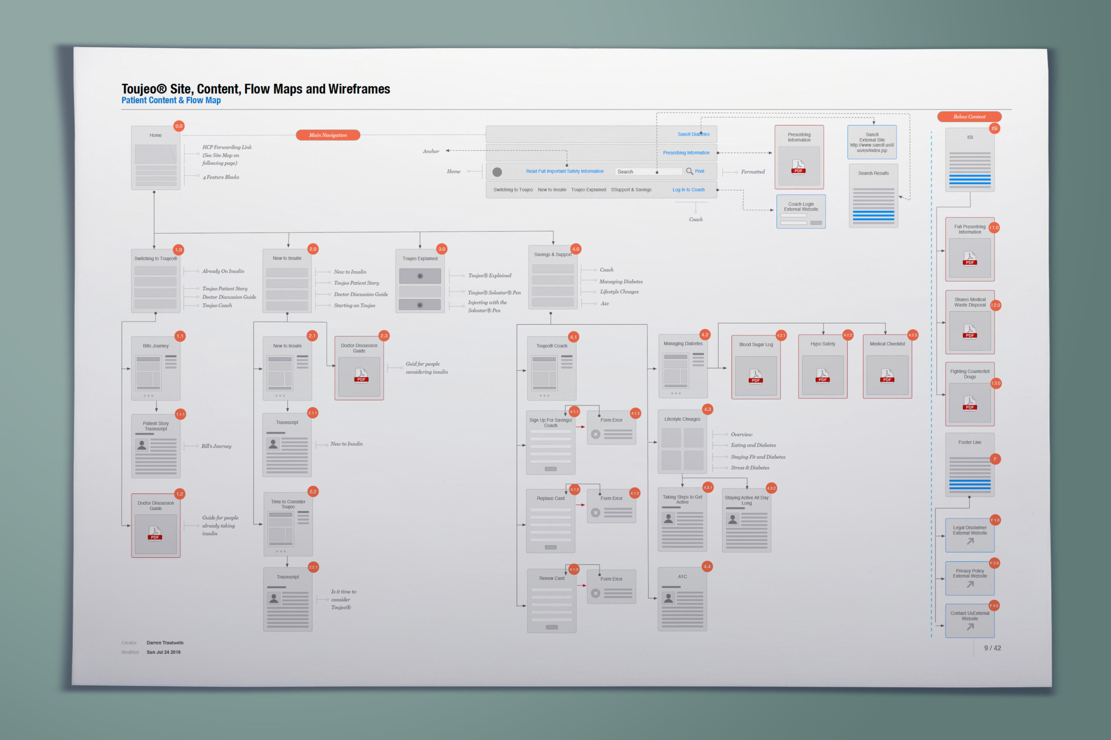
05 — Information Architecture
The information architecture reorganized complex pharmaceutical information around user intent rather than internal content structures.For patients, information was grouped around understanding the treatment, beginning therapy, administration, support, savings, and safety.For healthcare professionals, the architecture prioritized product information, clinical evidence, dosing, administration, safety, and patient resources.This allowed each audience to navigate Toujeo according to their own mental model while maintaining consistency across the larger digital ecosystem.
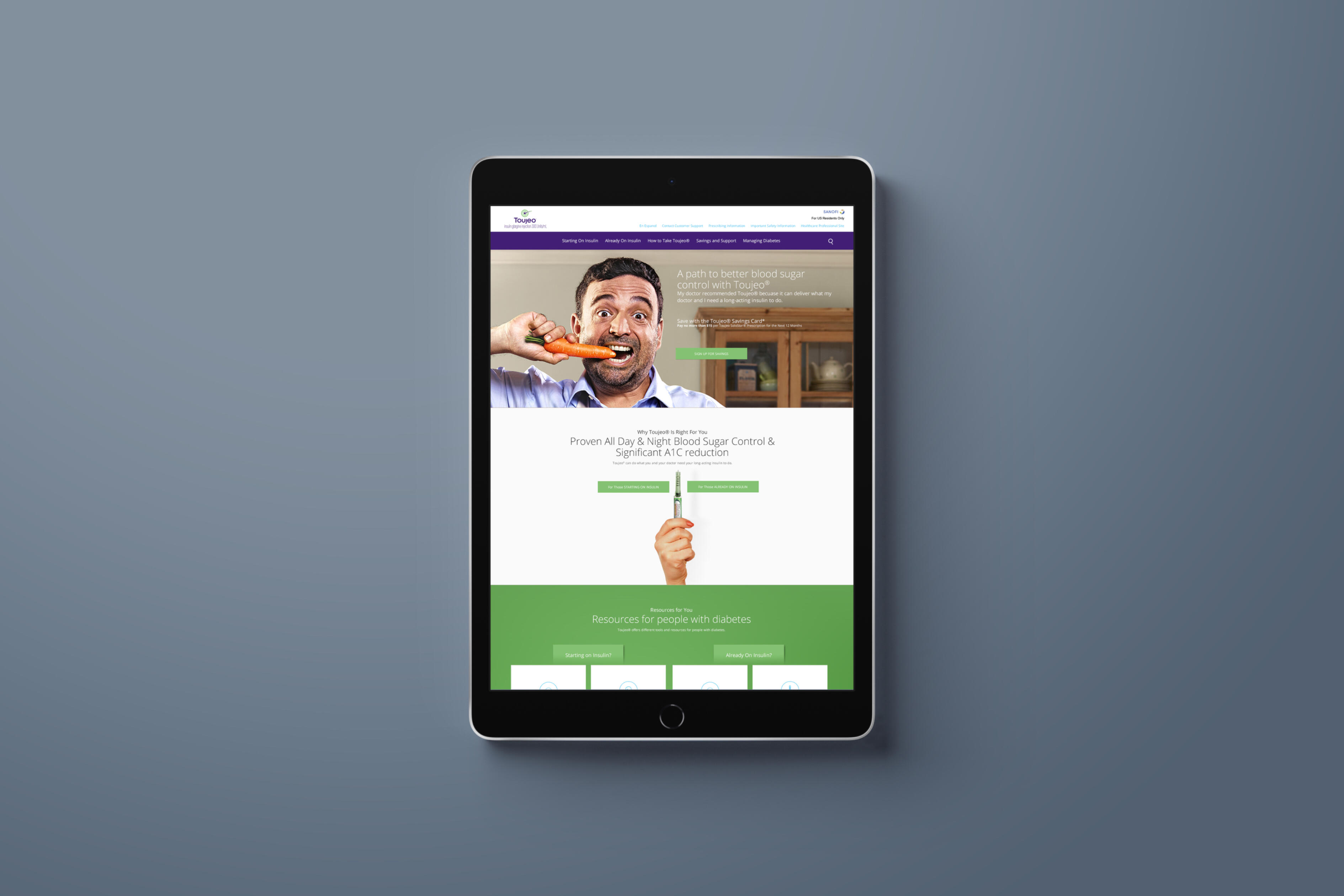
06 — Patient Experience
The patient experience was designed to make a complex pharmaceutical product feel more understandable and approachable.Information was progressively disclosed so patients could first understand essential concepts and then explore additional detail when needed.The experience emphasized:• Clear treatment education
• Understandable content hierarchy
• Starting-treatment information
• Administration guidance
• Savings and affordability resources
• Patient-support programs
• Safety information
• Clear next stepsThe goal was not simply to present information—it was to help patients understand what the information meant for them and what they could do next.
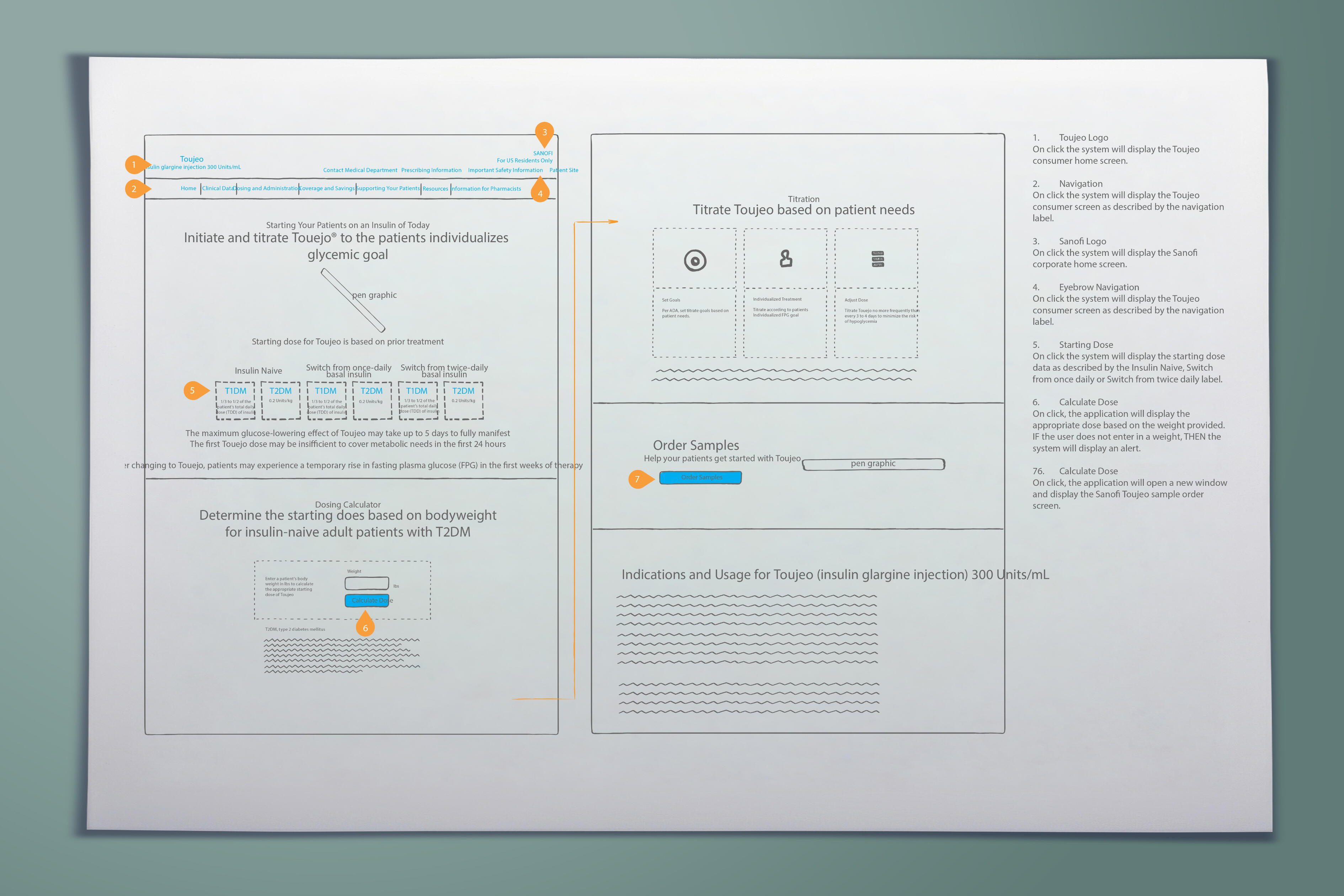
07 — Healthcare Professional Experience
The HCP experience was optimized around clinical relevance and speed of information retrieval.Healthcare professionals could move efficiently between high-level product information and deeper clinical content without navigating through patient-oriented educational material.The experience prioritized:• Product positioning
• Clinical evidence
• Dosing information
• Administration
• Safety information
• Prescribing information
• Patient education resources
• Patient support programsThis created an experience designed around the way clinicians seek information rather than simply reproducing pharmaceutical content online.

08 — Content Hierarchy & Progressive Disclosure
One of the central UX challenges was balancing large amounts of required information with usability.Content hierarchy was used to distinguish between primary information, supporting information, detailed clinical content, and required safety information.Progressive disclosure allowed users to begin with the information most relevant to their immediate question and move deeper when additional detail was required.This was particularly important for the patient experience, where presenting too much clinical information simultaneously could increase cognitive load.

09 — Interaction Design
Interaction patterns were designed to help users understand where they were, what information was available, and where they could go next.Clear navigation, content grouping, contextual calls to action, and consistent interaction patterns established predictable behavior throughout the experience.Calls to action were designed around user intent rather than generic navigation:• Learn About Toujeo
• Understand How Toujeo Is Used
• Explore Savings & Support
• Review Clinical Data
• View Dosing Information
• Access Patient Resources
10 — Designing for Health Literacy
Patient-facing healthcare experiences require more than visual simplicity.Information must be understandable to users with different levels of health knowledge without compromising medical accuracy.The experience used hierarchy, contextual organization, scannable content, and progressive disclosure to help make complex information easier to understand.This allowed the experience to support both users seeking a basic understanding of Toujeo and those looking for more detailed treatment information.
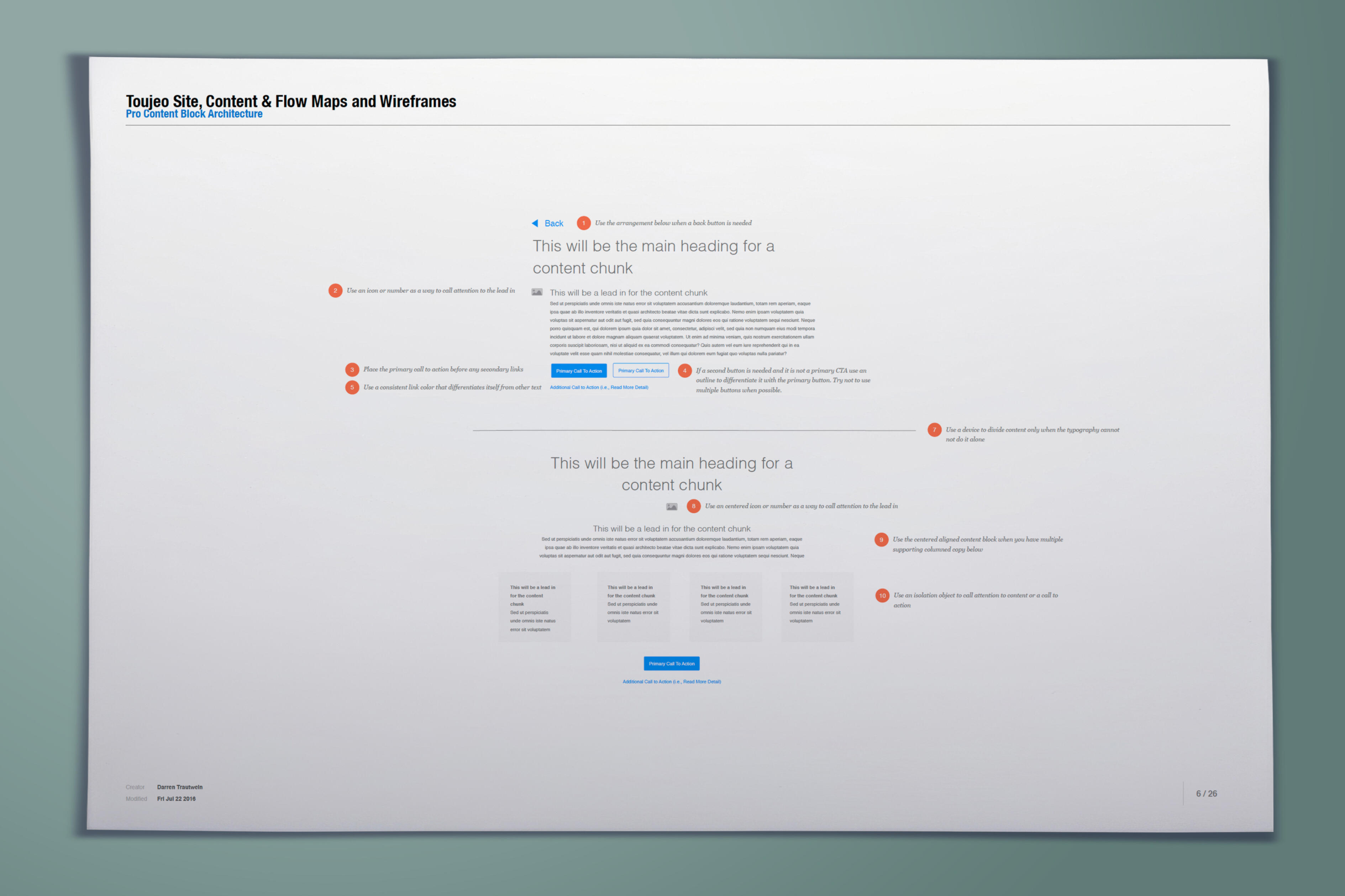
11 — Designing Within Pharmaceutical Requirements
The experience needed to balance user needs with the requirements of a highly regulated pharmaceutical environment.The design accommodated:• Important Safety Information
• Prescribing information
• Approved product claims
• Required disclosures
• Medical review
• Legal review
• Regulatory requirements
• Brand standardsThese requirements were treated as part of the experience-design problem rather than content that simply needed to be added after the UX was completed.
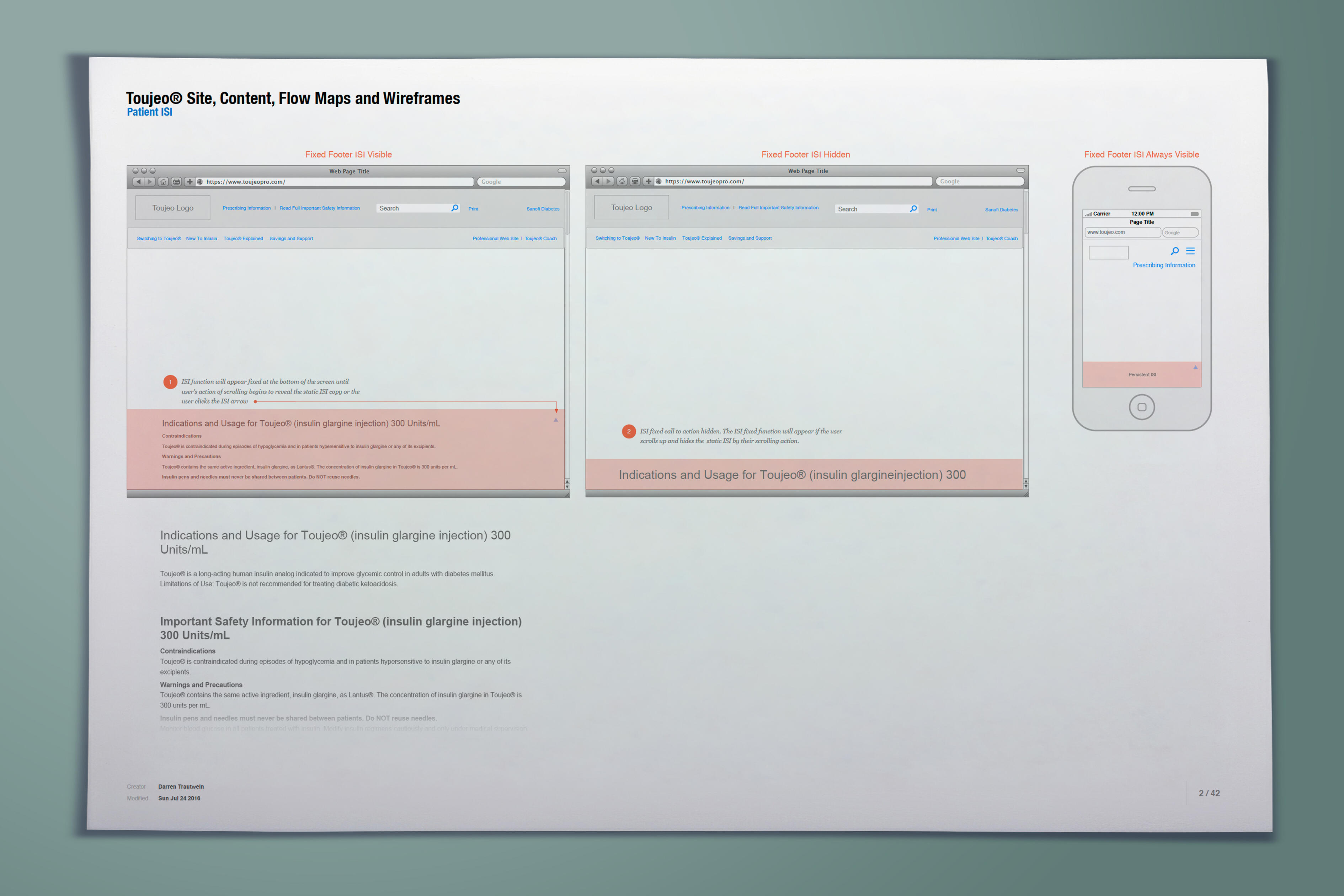
12 — Review & Iterate
The experience evolved through collaboration and review across UX, brand, content, medical, legal, regulatory, and development stakeholders.Feedback was incorporated while protecting the core user journeys and ensuring required pharmaceutical information remained appropriately represented.This iterative process helped balance three important requirements:User Needs + Business Needs + Regulatory Requirements
13 — Creating a Connected Toujeo Ecosystem
Although patients and healthcare professionals required different experiences, they were ultimately interacting with the same treatment ecosystem.Shared visual patterns, terminology, interaction behaviors, and brand elements created continuity between the experiences while allowing the information architecture and content hierarchy to remain audience-specific.The result was not one website adapted for two audiences.It was one product ecosystem designed around two different user needs.
14 — Outcome
The redesigned Toujeo patient and healthcare professional experiences transformed complex pharmaceutical information into clearer, audience-specific digital journeys.For patients, the experience made treatment information easier to understand, navigate, and act upon while providing clearer pathways to education, savings, and support.For healthcare professionals, the experience improved access to clinically relevant product, dosing, safety, and patient-support information.For Sanofi, the redesign created a more cohesive digital product experience capable of supporting both sides of the treatment relationship while operating within the requirements of a regulated pharmaceutical environment.
Same Treatment. Two Different Experiences.
Toujeo reinforced an important principle of healthcare experience design:A shared product does not mean shared user needs.Patients approach treatment seeking understanding, confidence, guidance, and support.Healthcare professionals approach treatment seeking evidence, clinical relevance, efficiency, and resources that help them make and communicate treatment decisions.By designing around those differences, I created two distinct experiences connected by a common Toujeo ecosystem—supporting the people managing diabetes and the professionals helping them manage it.
RxNETWORK
Client: RxNetwork
Role: UX / Product Design Leadership
Category: Digital Health / Pharmacy / Medication Adherence
Experience: UX Strategy • Human-Centered Design • Product Design • Journey Design • Behavioral Design • Gamification • Dashboard Design • Data Visualization • Workflow Design • Healthcare Technology
01 — The Challenge
Medication only works when patients take it.Medication non-adherence is more complicated than simply forgetting to take a prescription. Patients must navigate prescriptions, refills, schedules, communications, health information, pharmacy relationships and changing routines.At the same time, pharmacies need to understand adherence behavior and maintain patient relationships. Providers and payers need visibility that can help them identify opportunities for intervention.The central UX challenge became: how can we make medication management easier for patients while giving pharmacies, providers and payers the tools needed to improve adherence?
02 — Discover
Understand why adherence breaks down.The first step was looking beyond the prescription itself. A patient can intend to follow a treatment plan and still encounter friction throughout the medication journey.The experience needed to account for receiving a prescription, understanding what needs to happen, remembering medication, maintaining a schedule, refilling medication, communicating with the pharmacy, receiving relevant health information and remaining motivated over time.That revealed the core ecosystem:Patient ↔ Pharmacy ↔ Provider ↔ Payer.
03 — Define
Reframe adherence from a reminder problem to an engagement problem.A medication reminder can solve one moment, but adherence is an ongoing behavior. The experience therefore needed to help people remain engaged with their medication journey over time.• Simple — Reduce the effort required to manage medication.
• Timely — Deliver reminders and communications when they can influence behavior.
• Relevant — Provide information based on the patient’s needs.
• Motivating — Reinforce positive behavior through incentives and gamification.
• Connected — Keep patient, pharmacy, provider and payer connected to the same adherence ecosystem.
• Actionable — Turn behavioral information into something stakeholders can use.
04 — Map the Medication Journey
Design around the complete adherence lifecycle.Rather than treating adherence as a single action, the experience was designed as a continuous lifecycle spanning medication start, daily adherence, refill and ongoing engagement.Prescription → Start → Schedule → Take → Track → Refill → Reward → Continue
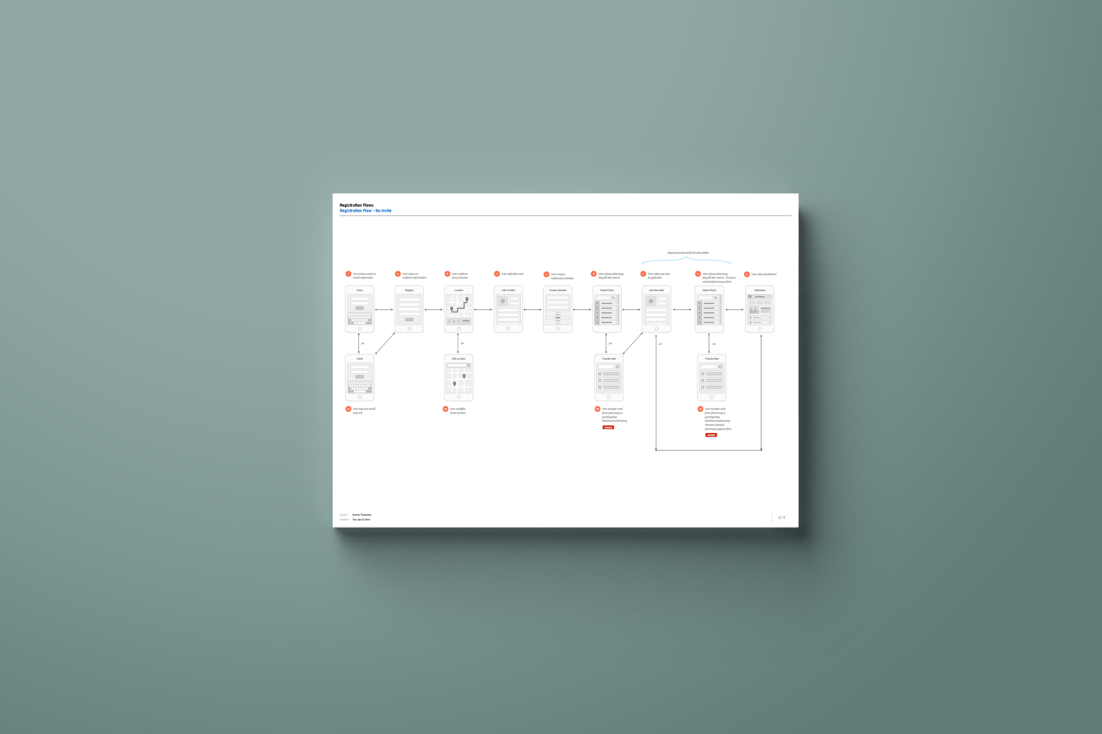
05 — Information Architecture
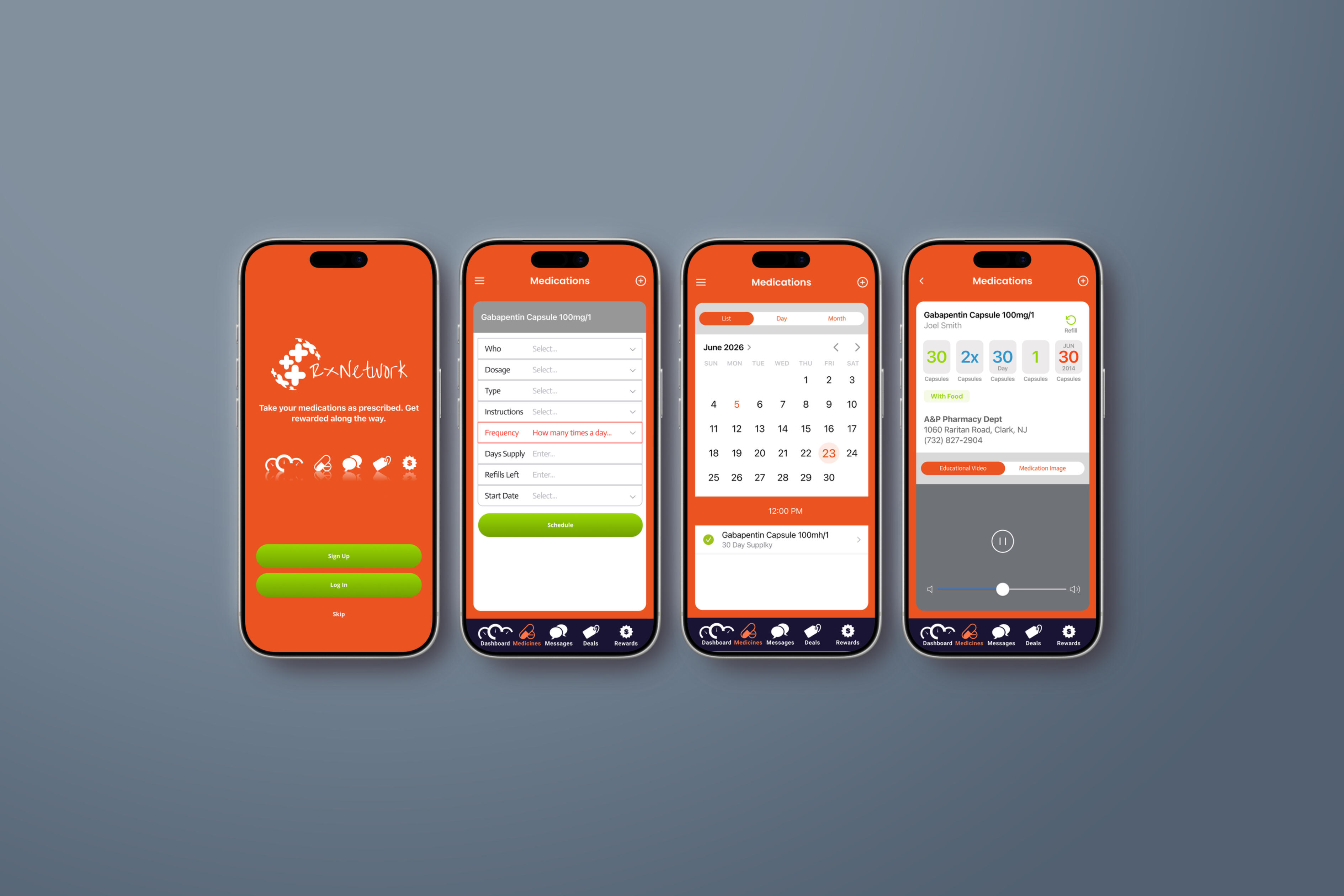
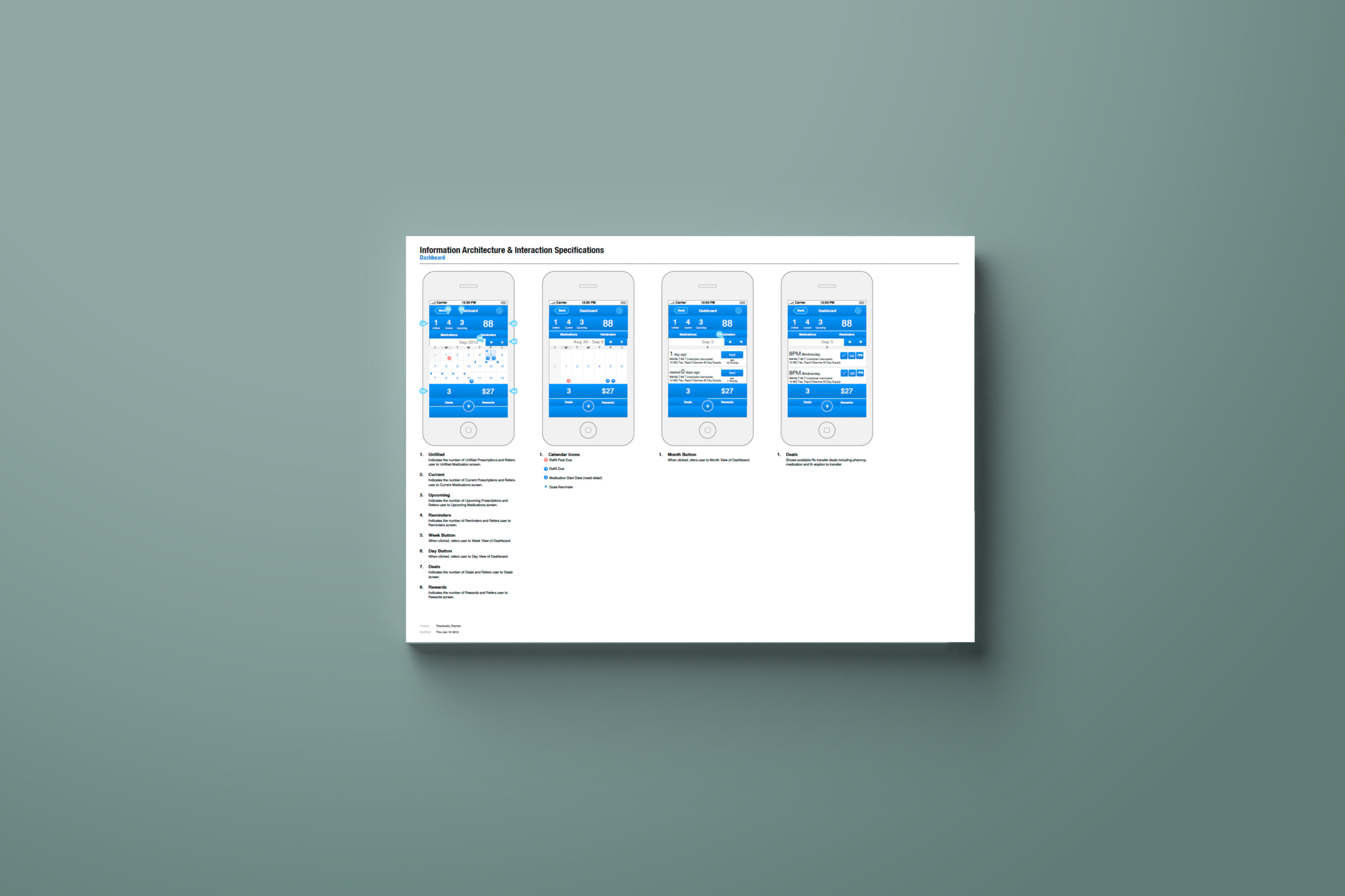
Create one ecosystem with different views of the same journey.The architecture supported very different users without creating disconnected products.• Medication Management — schedules, reminders, medication activity and refill status.
• Adherence — behavioral tracking and progress.
• Communication — patient-pharmacy interactions and relevant notifications.
• Rewards — incentives and engagement programs connected to desired behaviors.
• Health & Wellness — personalized information supporting the broader health journey.
• Analytics — actionable adherence information for pharmacies and other stakeholders.
06 — Patient Experience
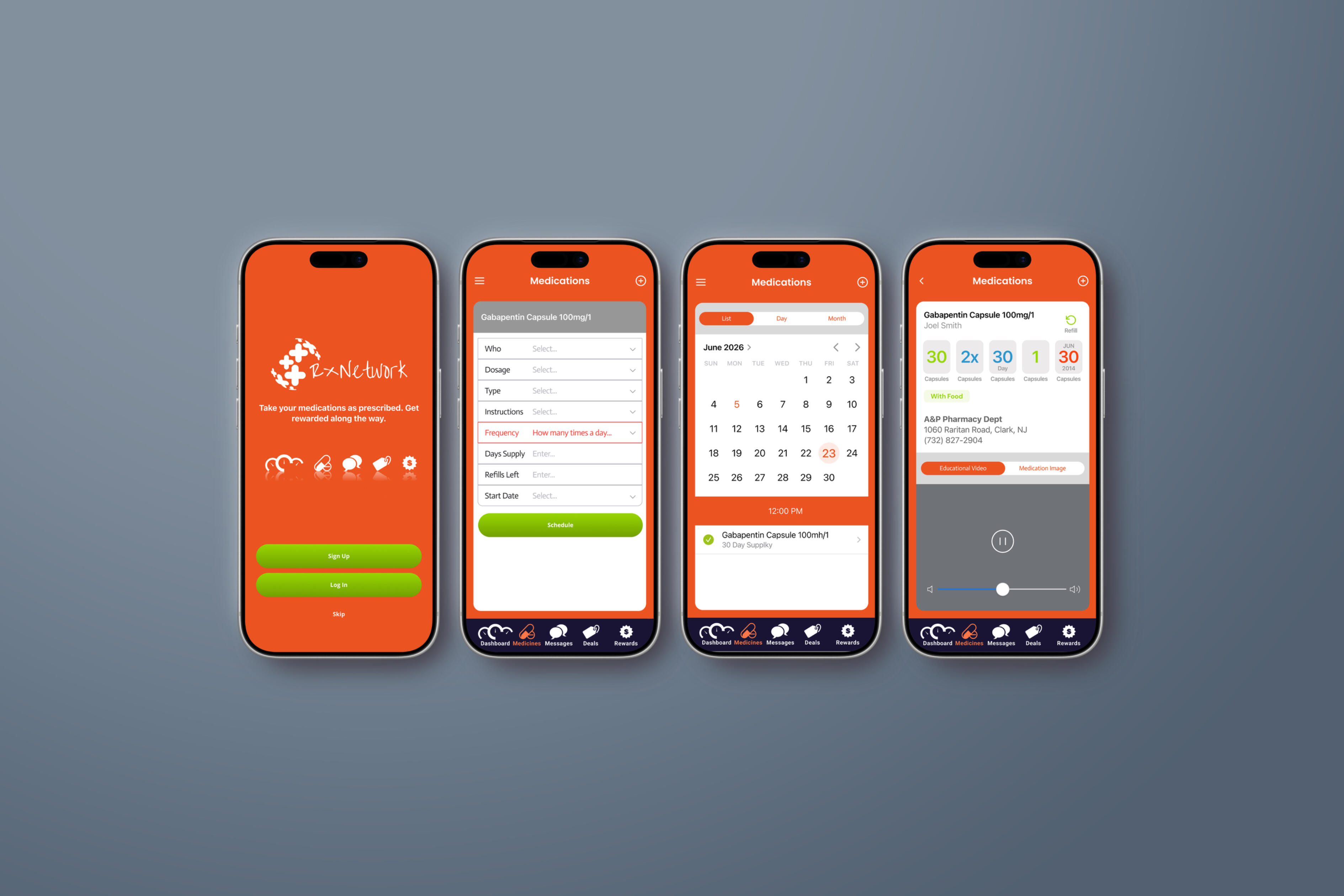
Make the right behavior easier.For patients, the interface needed to remove complexity rather than introduce more healthcare administration. The core experience connected reminders, gamification, incentives and tailored health and wellness information.The interface surfaced the next relevant action rather than asking users to manage all of their medication information at once.Reminder → Action → Confirmation → Progress → Reward
07 — Behavioral Design
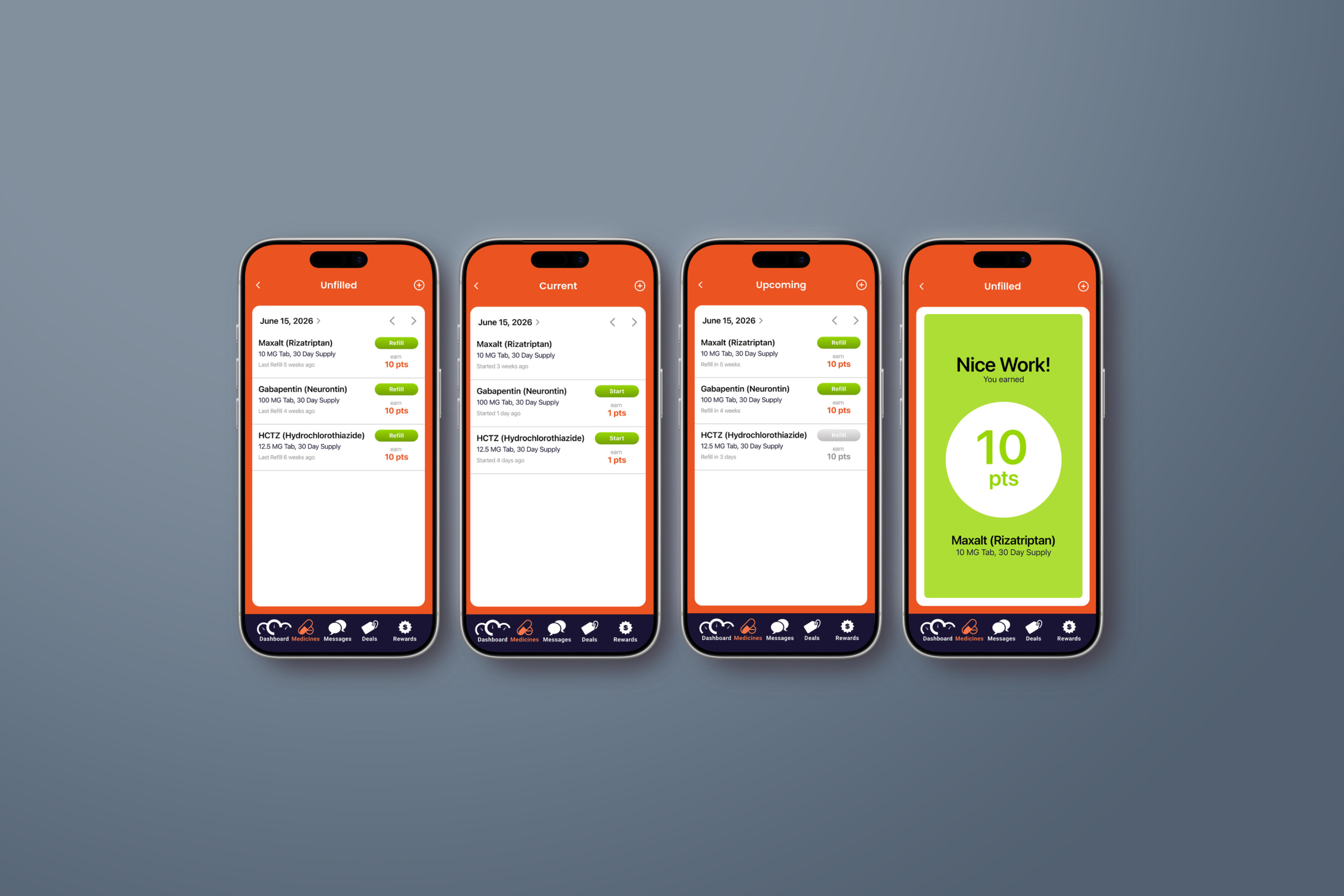
Turn adherence into a behavior that can be reinforced.RxNetwork combined behavioral tracking, gamification, alerts, rewards and engagement tools. The role of gamification was not to trivialize medication but to make positive behaviors visible and reinforce consistency.The emotional model shifted from correction toward encouragement.Prompt → Action → Recognition → Reward → Progress → Repeat
08 — Rewards & Loyalty
Create value for positive health behavior.Automated pharmacy rewards helped incentivize patients, improve refill behavior and strengthen loyalty. The UX connected desired behavior directly to recognition and reward.
The model created both health value and business value when incentives were properly aligned.Desired Behavior → Recognition → Reward → Continued Engagement
09 — Pharmacy Experience
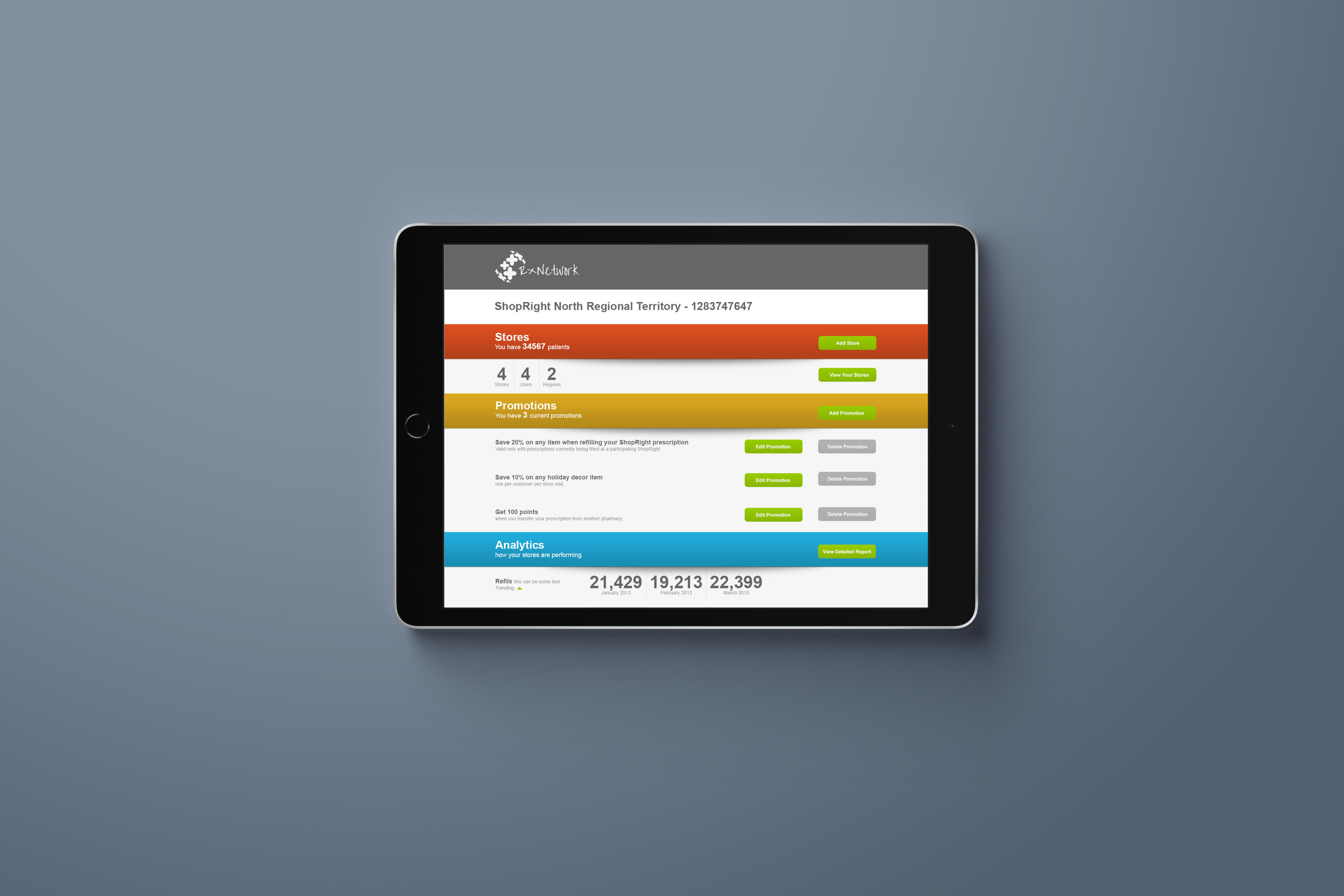
Turn adherence data into an opportunity to act.Patients needed simplicity; pharmacies needed visibility. The pharmacy experience helped teams understand who was adherent, who might be falling behind, who needed a refill, who might benefit from communication and where attention should be focused.Automation also reduced the operational effort required for communication and tracking.Data → Priority → Intervention → Outcome
10 — Provider & Payer Experience
Make adherence visible beyond the pharmacy.Providers and payers needed real-time information that could support proactive intervention and care while addressing the cost implications of poor adherence.The same underlying ecosystem supported different decisions according to role.
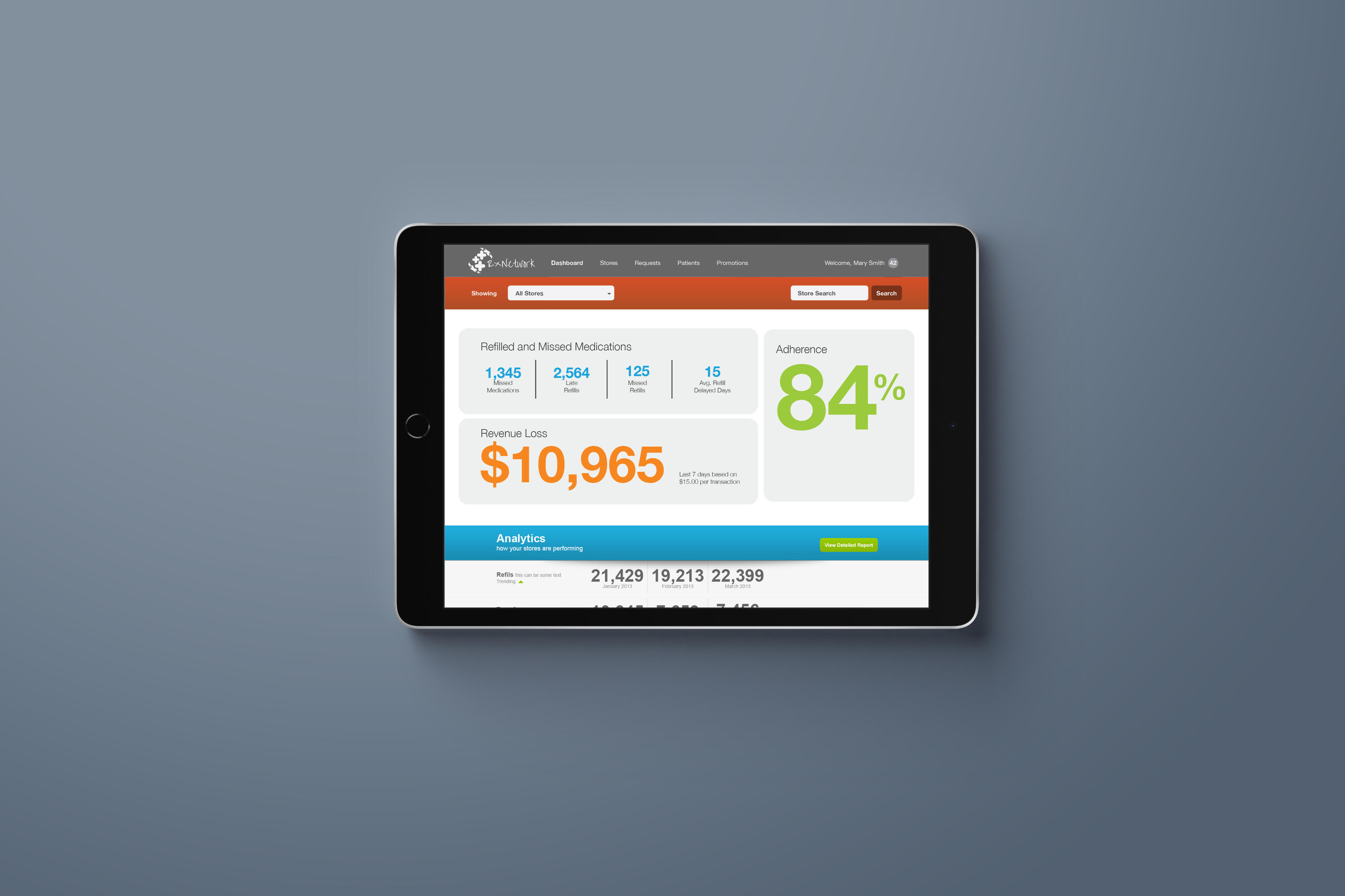
11 — Dashboard & Data Visualization
Do not show everything. Show what deserves attention.The professional side of RxNetwork could generate significant amounts of behavioral information. The dashboard hierarchy was designed to move from population to segment to patient to behavior to action.This turned analytics from reporting into decision support.Population → Segment → Patient → Behavior → Action
12 — Communication
Deliver the right message at the right moment.Medication experiences can quickly become noisy if every interaction generates a notification.Communication therefore needed to be prioritized according to relevance across medication reminders, refill reminders, adherence interventions, rewards and health information.The goal was relevant message → appropriate moment → clear action.
13 — Integration Into Existing Pharmacy Workflows
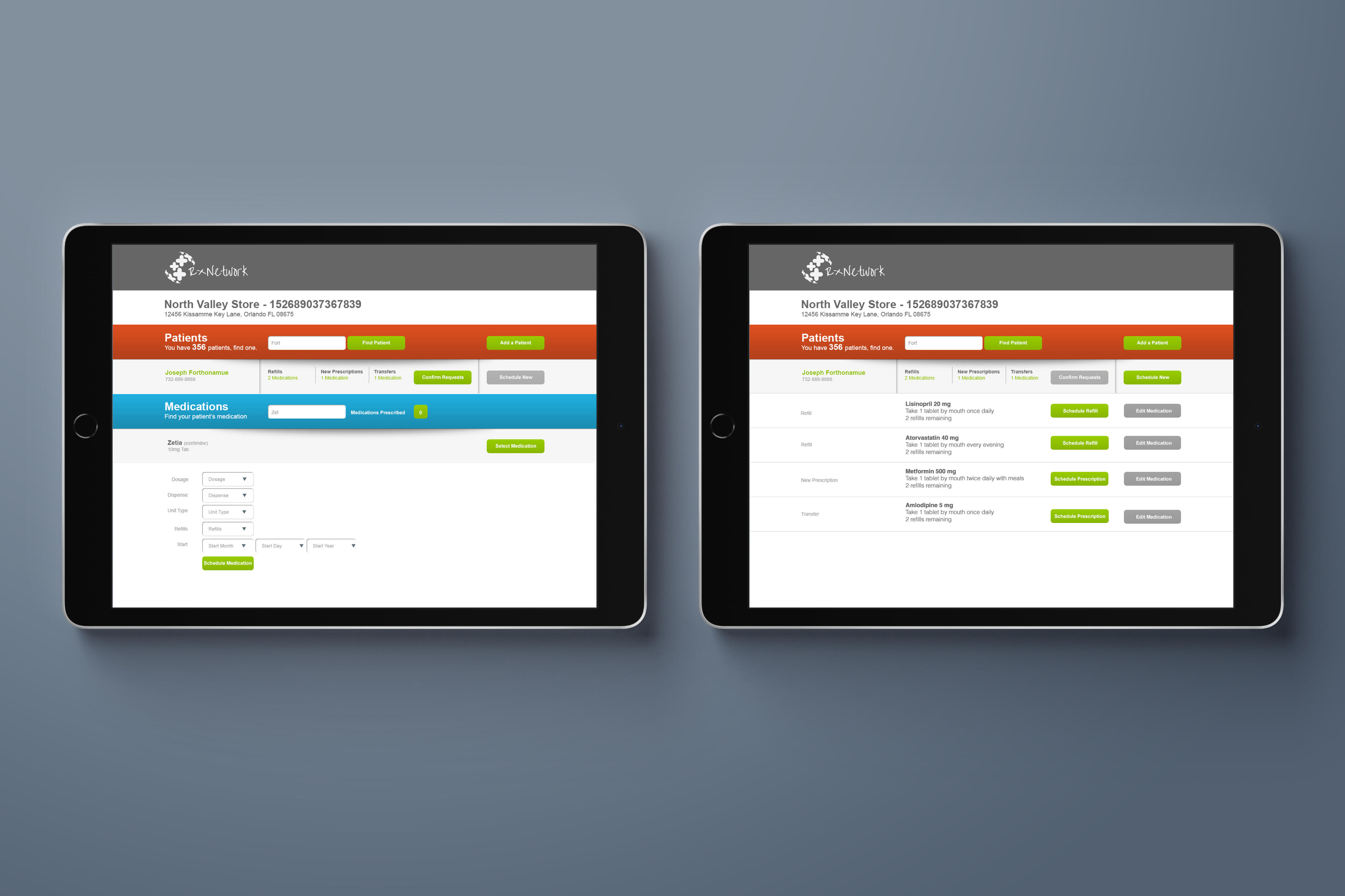
Do not make better UX create more work.RxNetwork was designed to integrate with existing pharmacy workflows and patient-management systems, reducing disruption during adoption.The design principle was to fit the workflow before asking the workflow to fit the product.
14 — Prototype, Test & Iterate
Test the behavior and the workflow—not simply the interface.A phased rollout enabled continuous testing and refinement of adherence tracking, rewards management and pharmacy communication tools. Testing also addressed scheduler, communication and analytics reliability and scalability.For patients, testing asked whether people understood what to do next and whether rewards reinforced engagement. For pharmacies, testing asked whether teams could identify patients requiring attention and intervene efficiently.Prototype → Test → Observe → Measure → Refine → Release → Learn
15 — Measuring Experience Through Behavior
Success is not a screen metric. It is a behavior change.The meaningful measures were medication adherence, prescription refills, patient retention, pharmacy transactions, engagement, operational efficiency and CMS Star Ratings.The case study reported 8–15% more prescription transactions through improved adherence, connecting experience design directly to behavioral, health and business outcomes.Experience → Behavior → Health Outcome → Business Outcome
16 — Designing for Scale
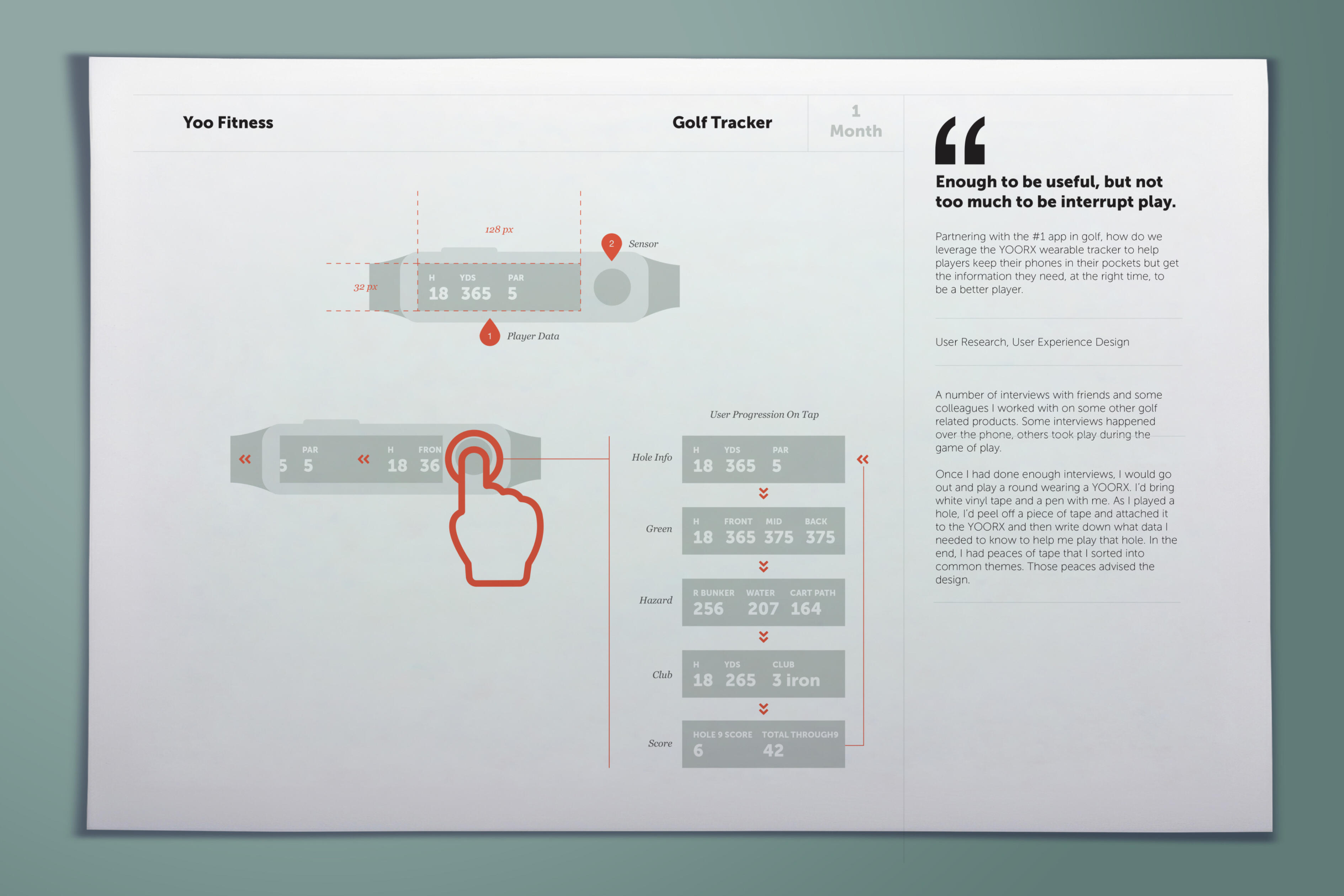
YOO Golf extended the YOO wearable ecosystem into golf performance, creating a focused experience that allowed players to track key on-course statistics, monitor performance trends, understand strengths and weaknesses, and use real-time data to improve their game.
17 — One Ecosystem. Multiple Stakeholders.
The strength of RxNetwork was not any individual feature. It was the system connecting patient medication behavior, reminders, adherence, pharmacy communication, rewards, refills and provider/payer insight.One experience architecture served multiple users without losing sight of the patient.Patient → Medication → Reminder → Adherence → Pharmacy → Communication → Reward → Refill → Provider/Payer Insight
18 — Outcome
A Scalable Medication Adherence Platform.RxNetwork connected scheduling, behavioral tracking, rewards, communication, personalized health information and analytics into a unified medication-management ecosystem.The resulting platform increased medication adherence, supported better patient outcomes and created pharmacy revenue opportunities while reducing operational burden.
Make adherence easier. Make progress visible. Make every interaction actionable.
RxNetwork demonstrates how UX can address a healthcare problem that is not solved by information alone. By connecting behavioral design, reminders, gamification, rewards, communication, pharmacy workflows and actionable analytics, the platform turned medication adherence into a connected experience benefiting patients and the organizations supporting them.Better Experience → Better Adherence → Better Outcomes → Better Business
YOO CHALLENGE
Client: YOO Fitness / YOO Challenge
Role: UX / Product Design Leadership
Category: Consumer Health / Fitness / Wearable Technology
Experience: UX Strategy • Human-Centered Design • Behavioral Design • Gamification • Mobile UX • Connected Products • Wearable Integration • Interaction Design • Dashboard Design • Product Design
01 — The Challenge
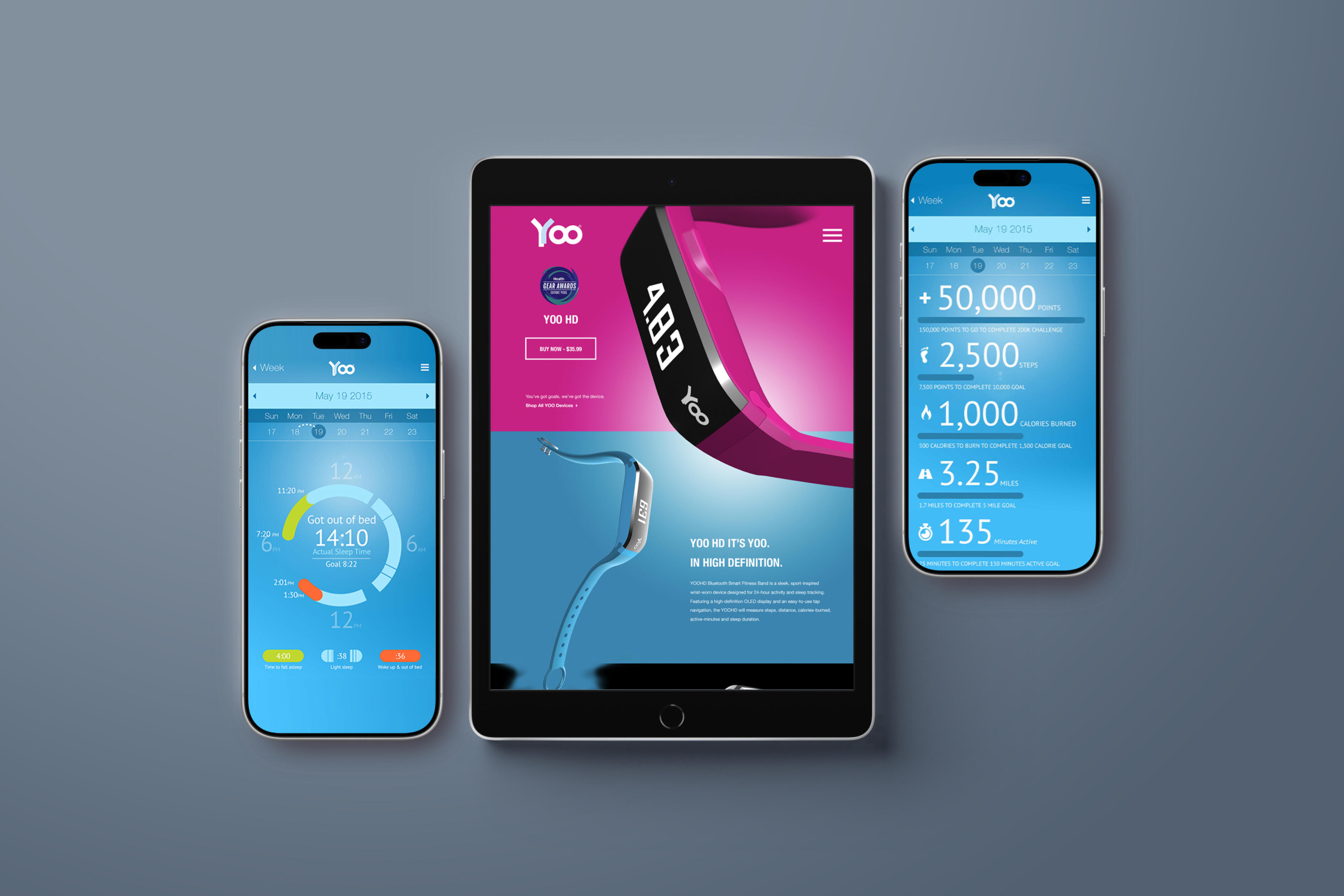
Fitness trackers can measure activity. The harder problem is motivating people to keep moving.YOO Challenge was not simply a step counter. The product needed to address a larger behavioral challenge: people may begin a fitness routine with strong intentions, but sustaining activity over time can be difficult.The app needed to help users stay consistently active, understand progress, build healthier routines, remain motivated after the novelty of tracking wears off and connect seamlessly with different YOO wearable devices.The UX challenge became: how do we transform passive fitness tracking into an experience people actually want to return to every day?
02 — Discover
Understand what prevents fitness tracking from becoming behavior change.Fitness products often assume that more information creates more motivation, but knowing a step count does not necessarily create a reason to move more.The important behavioral questions were what gives someone a reason to keep going, how progress can feel visible before a major goal is reached, how competition can motivate without discouraging less-active users, how consistency can be rewarded and how syncing can become part of the engagement experience rather than a technical chore.
03 — Define
Reframe the experience from tracking fitness to competing with yourself.YOO Challenge created a different behavioral model: New YOO vs. Old YOO. Users were not primarily competing against elite athletes, friends or anonymous leaderboard participants. They were competing against their previous level of activity.That concept positioned improvement as personal: yesterday’s YOO establishes the challenge; today’s YOO tries to beat it.
04 — Establish the Behavioral Design Principles
The product strategy was organized around progress over perfection, visible achievement, small wins, positive reinforcement, challenge, surprise and reward, and consistency.Do → See Progress → Feel Rewarded → Want to Do More
05 — Map the User Journey
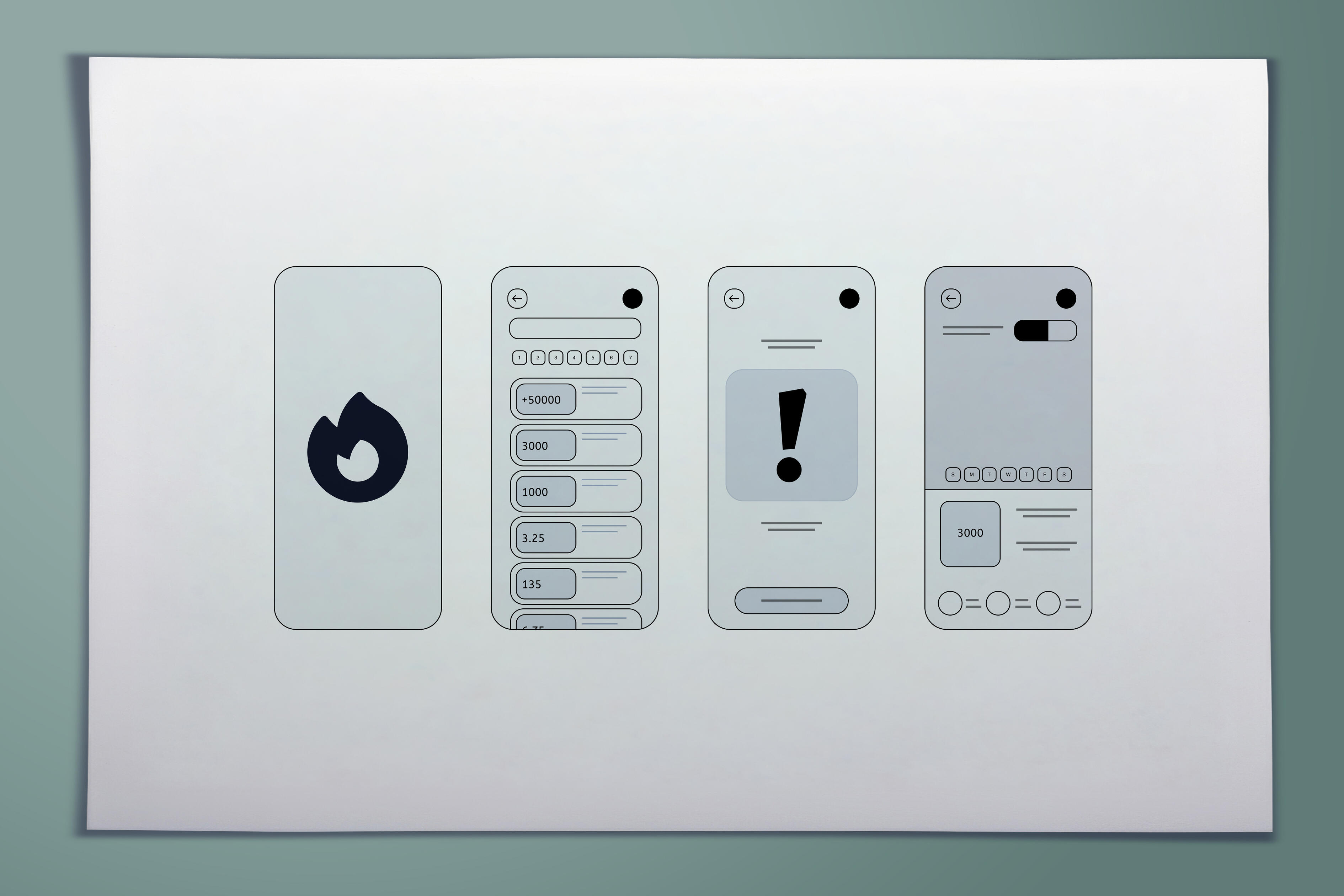
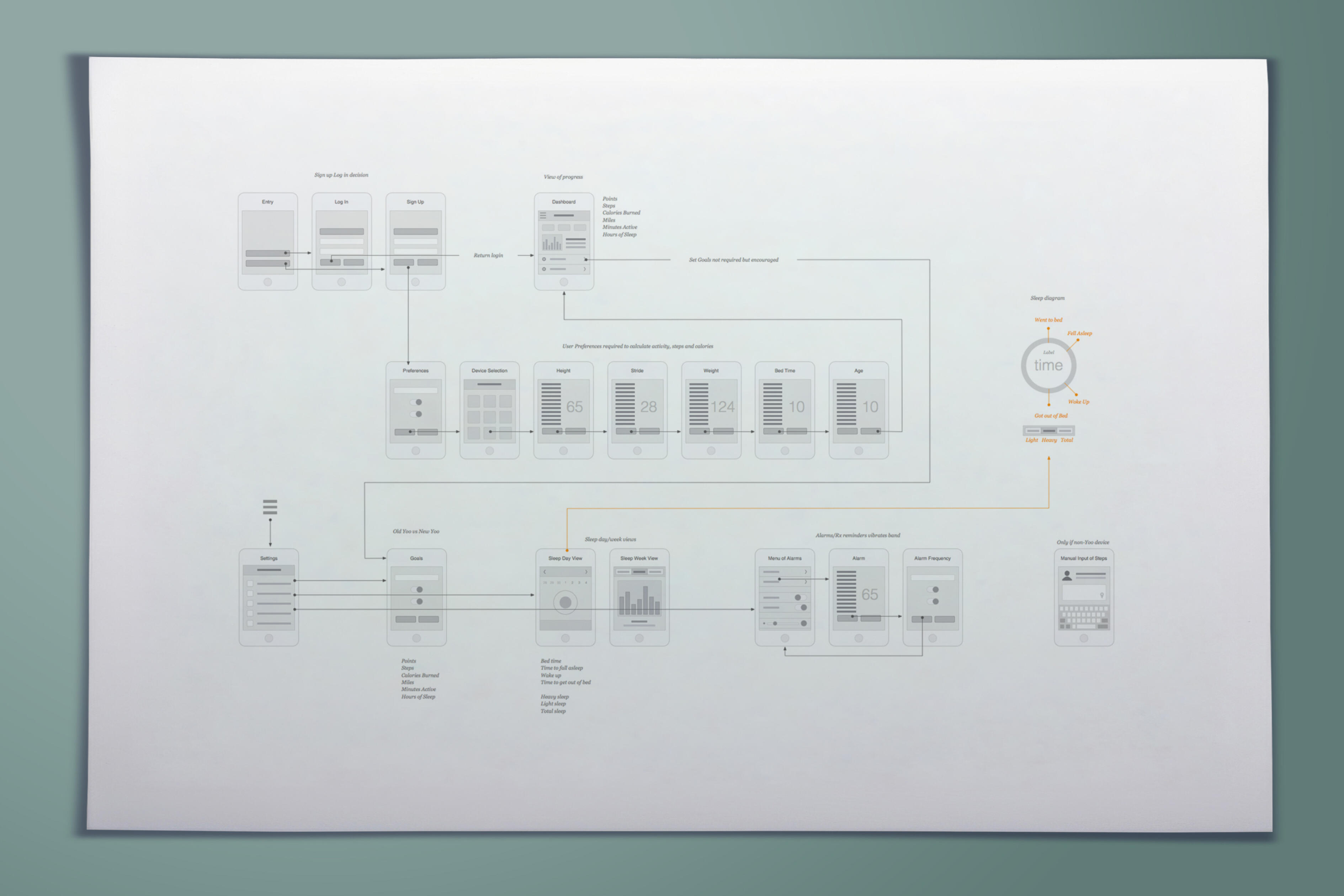
Design around a daily behavioral loop.Unlike a transaction-based product, YOO needed to create a reason to return continuously. The core journey connected daily activity, goal achievement, bonus engagement and progression.Wear → Move → Sync → See Progress → Receive Feedback → Earn Reward → Set Next Goal → Repeat
06 — Information Architecture
Keep the experience focused on what motivates action.The architecture centered on Today, Challenge, Progress, Rewards, Sleep and Device. The purpose was not simply categorization; it supported a behavioral sequence that helped users understand what they were doing, how they were doing and what they could achieve next.What am I doing? → How am I doing? → What can I achieve next?
07 — Gamification
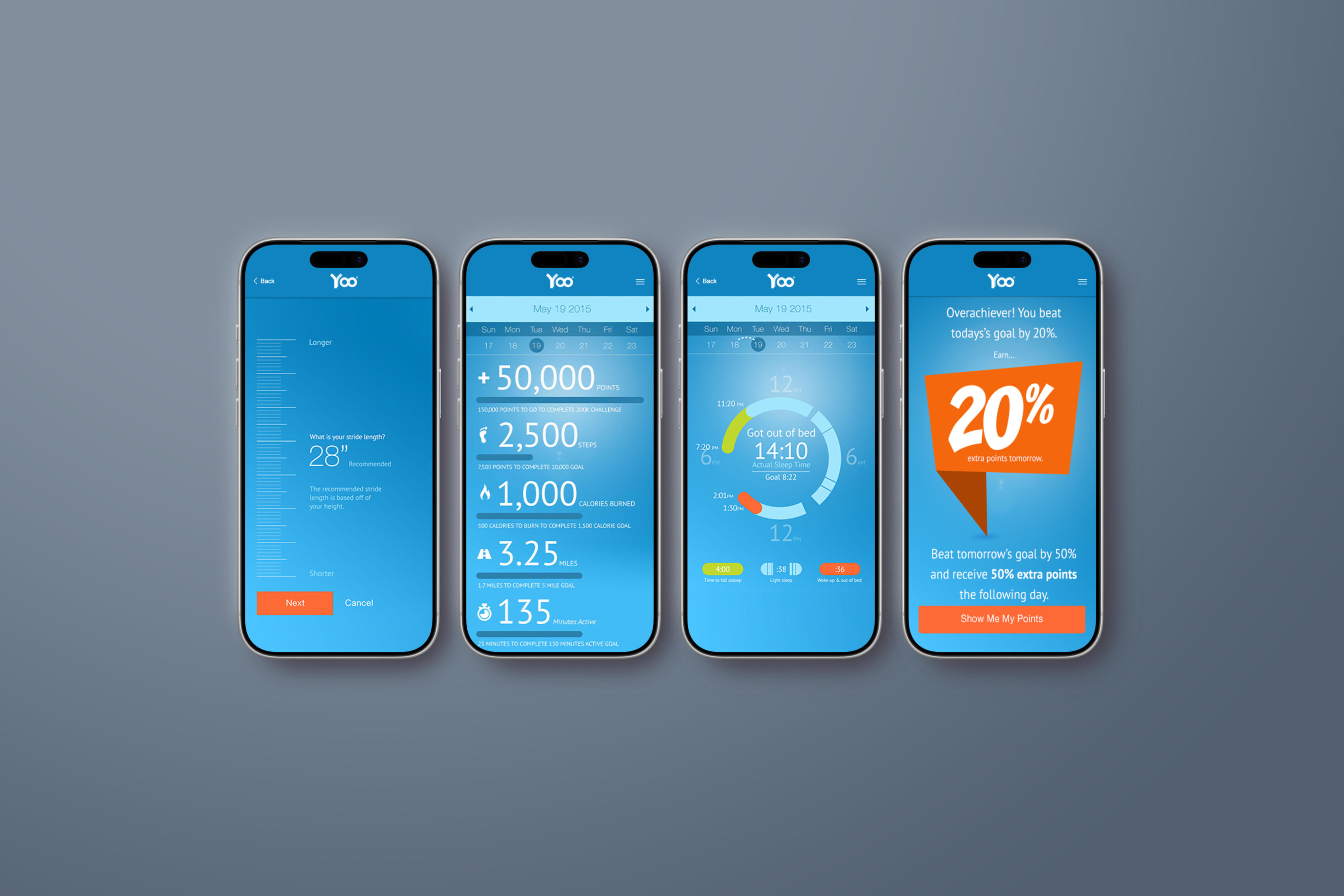
Turn ordinary activity into something worth pursuing.Gamification was central to YOO Challenge, but it needed to reinforce actual health behavior rather than sit on top of fitness data as decoration.The system combined New YOO vs. Old YOO, Power YOO and Super YOO progression, Power Hours, points, streaks, and daily, weekly and cumulative challenges.Challenge → Activity → Achievement → Reward → Progression → New Challenge
08 — Designing New YOO vs. Old YOO
Make competition personal rather than intimidating.The design insight was changing who the user competes against. Traditional fitness products often create “You vs. Other People.” YOO created “You vs. Yesterday’s You.”Old YOO represented previous behavior; New YOO represented progress. The user became both the competitor and the success story, giving raw activity data emotional meaning.
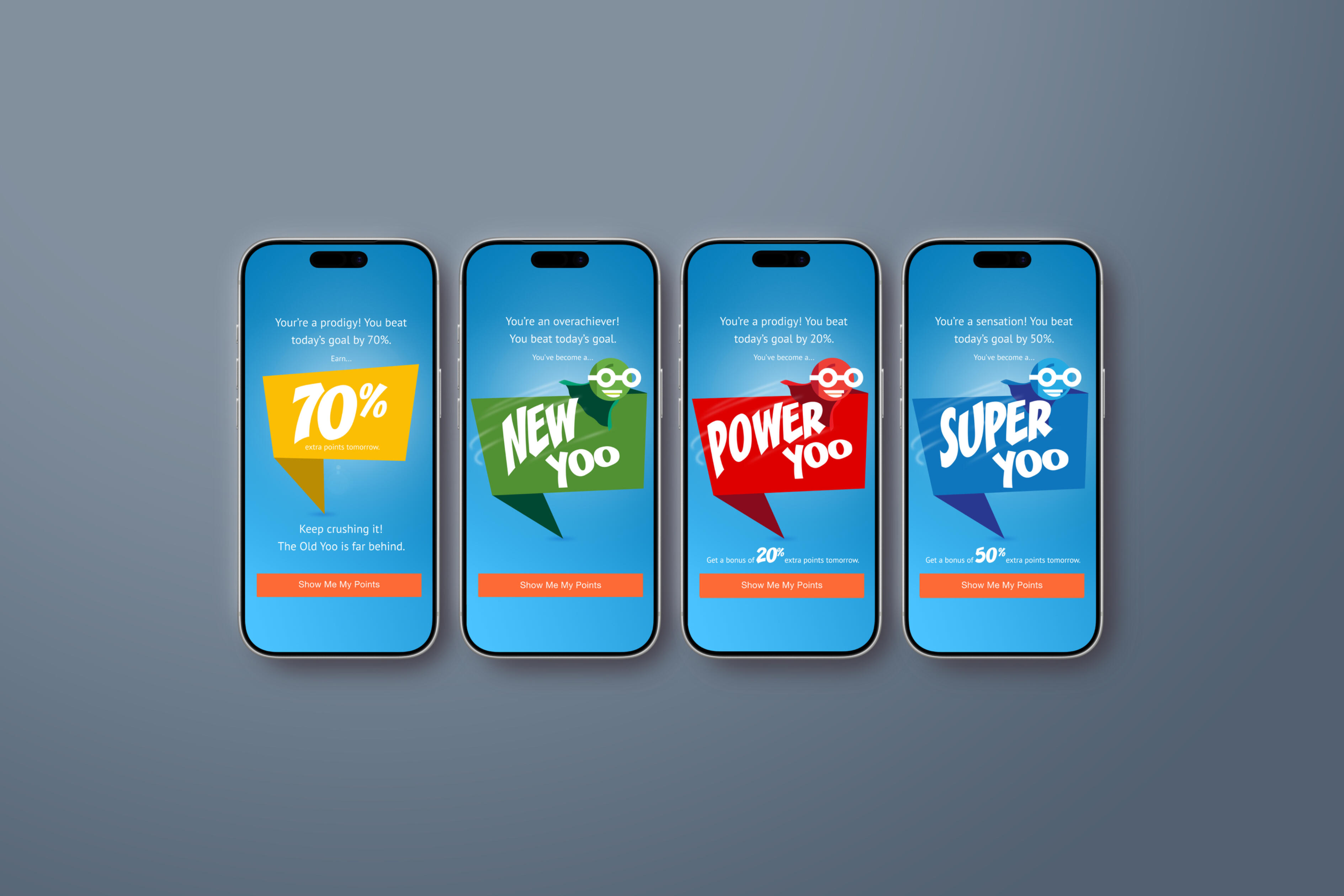
09 — Character Progression
Give progress a personality.As users reached milestones, they could unlock advanced representations such as Power YOO and Super YOO. The character became a progress indicator, reward mechanism, motivational device and brand personality.As the user’s behavior improved, their YOO evolved.
10 — Wearable Integration
Make the physical device and digital experience feel like one product.YOO Challenge needed to work with multiple generations of hardware. YOO 1 used Motion Echo close-proximity synchronization, while YOO 2 and YOO C supported Bluetooth Smart connectivity.From the user’s perspective, those technical differences should not dominate the experience. The desired model was simple and consistent.Wear → Move → Sync → See Results
11 — Designing the Sync Experience
Turn a technical requirement into part of the behavioral loop.Synchronization was not only infrastructure; it was also a behavioral moment because syncing revealed the results of the user’s activity.The product rewarded positive habits including daily syncing and surpassing step goals with bonus points and streak rewards. Syncing could therefore feel like a reveal rather than maintenance.Sync → Feedback → Reward
12 — Dashboard & Progress Visualization
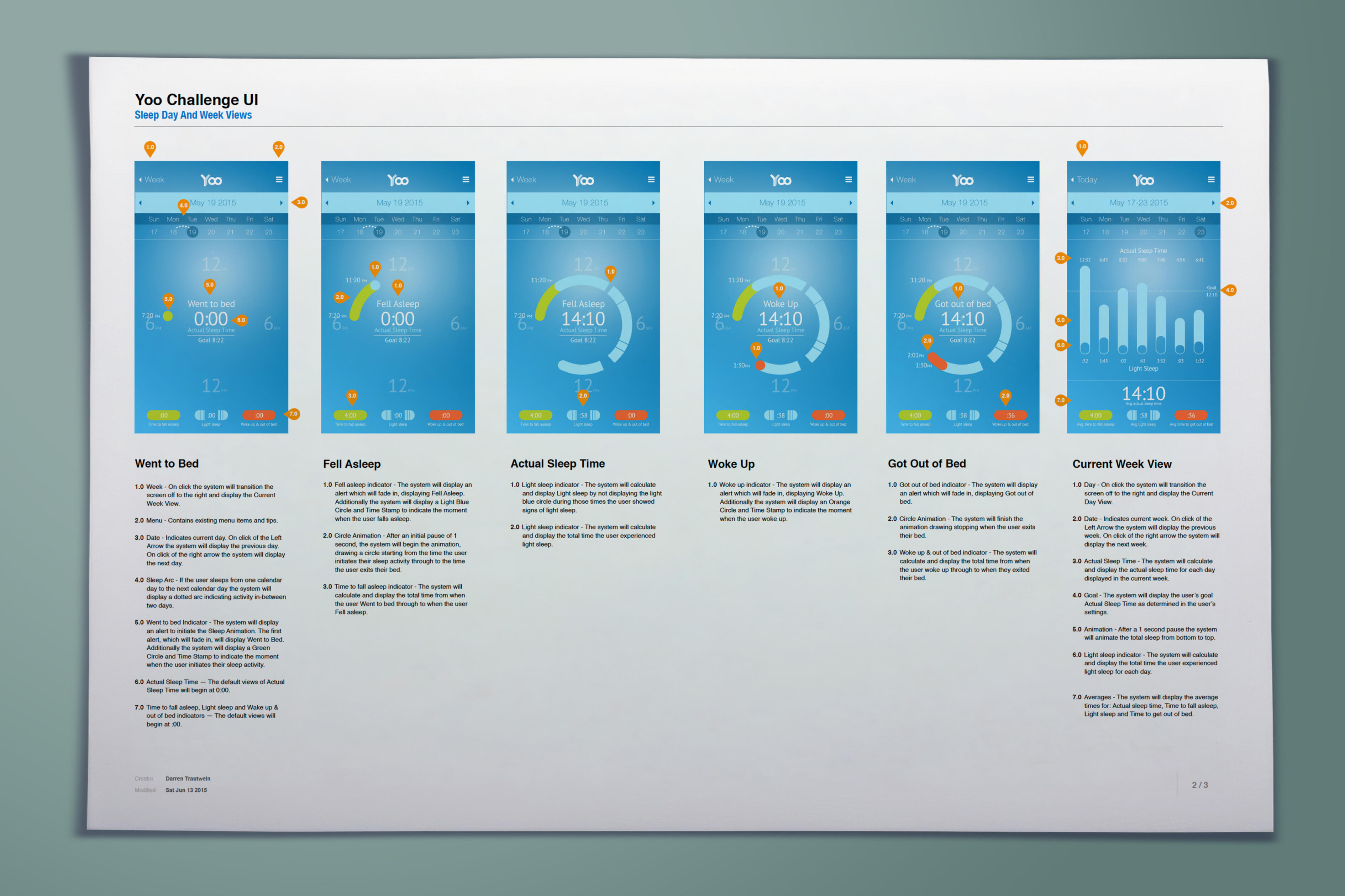
Show progress before showing data.The dashboard provided clear progress indicators and needed to answer where the user was now, how close they were to the goal, whether they were doing better than before and what would happen if they kept going.The point of visualization was not simply understanding; it was motivation.Status → Progress → Achievement → History
13 — Feedback & Microinteractions
Celebrate the behavior at the moment it happens.Gamified messaging such as “You GO New YOO!” celebrated progress and encouraged continued activity. These small moments connected positive emotion directly to the behavior the product wanted to reinforce.A simple success message tells the user that what they just did mattered.
14 — Dynamic Challenges
Give users reasons to come back tomorrow.Daily, weekly and cumulative challenges, along with Power Hours and real-time feedback, created different motivational horizons. Daily challenges created immediate action, weekly challenges encouraged consistency, cumulative challenges supported long-term progression and Power Hours introduced urgency and spontaneity.
15 — Habit Formation
Design for repetition without making repetition boring.The ultimate goal was repeated physical activity, not app engagement for its own sake. The experience connected cues, behavior, feedback, reward, anticipation and repetition into a habit loop.Cue → Behavior → Feedback → Reward → Anticipation → Repeat
16 — Prototype, Test & Iterate
Test whether the mechanics actually motivate—not just whether users can operate them.
Usability testing needed to cover device connection, syncing, progress comprehension and challenge navigation, while behavioral validation needed to determine whether New YOO vs. Old YOO was understood, whether rewards felt meaningful, whether challenges motivated return behavior and whether progression encouraged continued use.
The project reported positive feedback around Power Hours, streak rewards and advanced New YOO characters for driving motivation and engagement.
17 — Measuring Experience Through Behavior
The best KPI was movement.App opens and session duration can indicate engagement, but the meaningful outcomes were activity levels, goal completion, daily synchronization, challenge participation, streak continuation and return engagement.The project reported higher activity levels and greater satisfaction associated with the app’s competitive and gamified elements.Better Experience → More Engagement → More Activity
18 — Designing for a Connected Product Ecosystem
The complete consumer experience included the wearable, device connection, mobile application, activity data, feedback, gamification and progression. The platform successfully supported synchronization across the YOO product range and established a scalable framework for future enhancements.
19 — Future Experience Opportunities
The scalable structure created opportunities to expand into third-party fitness integrations and multiplayer challenges while keeping the original behavior model understandable.Self Competition → Expanded Personal Ecosystem → Social Competition
20 — One Product. One Continuous Motivation Loop.
The strength of YOO Challenge was not any single feature. It was the system connecting wearable activity, synchronization, progress visualization, New YOO vs. Old YOO, gamification, rewards and progression.Wear → Move → Sync → Compare → Receive Feedback → Earn Points → Build Streak → Unlock → Challenge Again
21 — Outcome
A Gamified Fitness Experience Built Around Behavior Change.YOO Challenge transformed activity tracking into a more engaging relationship between the user, wearable and digital product. The experience connected multiple YOO devices while introducing personal competition, Power Hours, streak rewards, character progression, daily and weekly challenges, progress dashboards and motivational feedback.The project reported increased activity and satisfaction, successful integration across the YOO device range, positive feedback around its gamification mechanics and a scalable foundation for future product evolution.
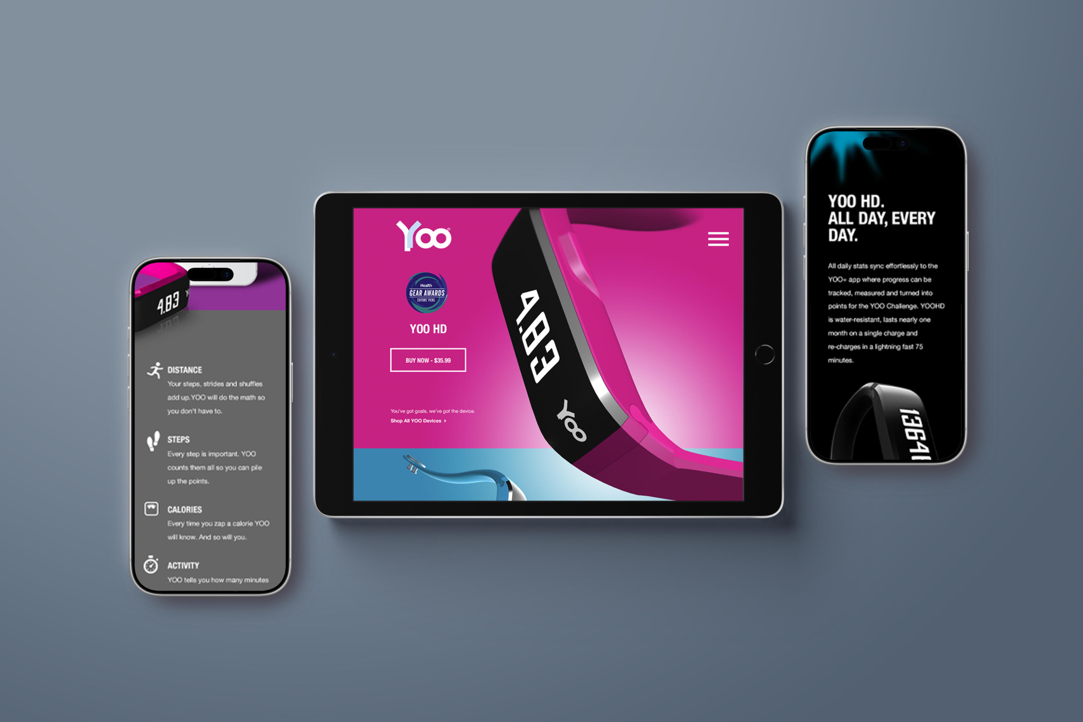
Do not just track the behavior. Give people a reason to change it.
YOO Challenge demonstrates how UX can transform raw activity data into a motivational consumer experience. By connecting wearable technology, personal competition, progress visualization, gamification, rewards, feedback and behavioral design, YOO moved beyond measuring activity and created a system designed to encourage more of it.Move → See Progress → Feel Rewarded → Move Again
Merck GMAX Affordability
Client: Merck
Role: Global Lead, UX & Digital Product Strategy
Category: Healthcare / Pharmaceutical
Experience: Design Thinking • UX Strategy • Human-Centered Design • Research • Information Architecture • Interaction Design • Product Design • Usability Testing • Digital Health
1 — The Challenge
Design Thinking
Global and regional access teams needed a more consistent way to identify, evaluate and implement affordability solutions across different markets. Existing processes varied by team and region, making it difficult to understand user needs, identify critical pain points and translate complex affordability requirements into a scalable digital experience.
2 — The Solution
A centralized digital affordability platform was created to provide teams with a consistent, guided approach for evaluating affordability needs and identifying appropriate solutions. The experience brought together assessment tools, decision support, resources and proven affordability strategies within a single platform, enabling teams to more efficiently move from identifying a market need to selecting and implementing a customer-focused affordability solution.
RevUp
Client: RevUp
Product: Healthcare Revenue Cycle Management Platform
Role: UX Strategy & Product Design Lead
Category: Healthcare Technology • Revenue Cycle Management
Experience: Enterprise UX • UX Strategy • Human-Centered Design • Workflow Design • Data Visualization
1 — Problem
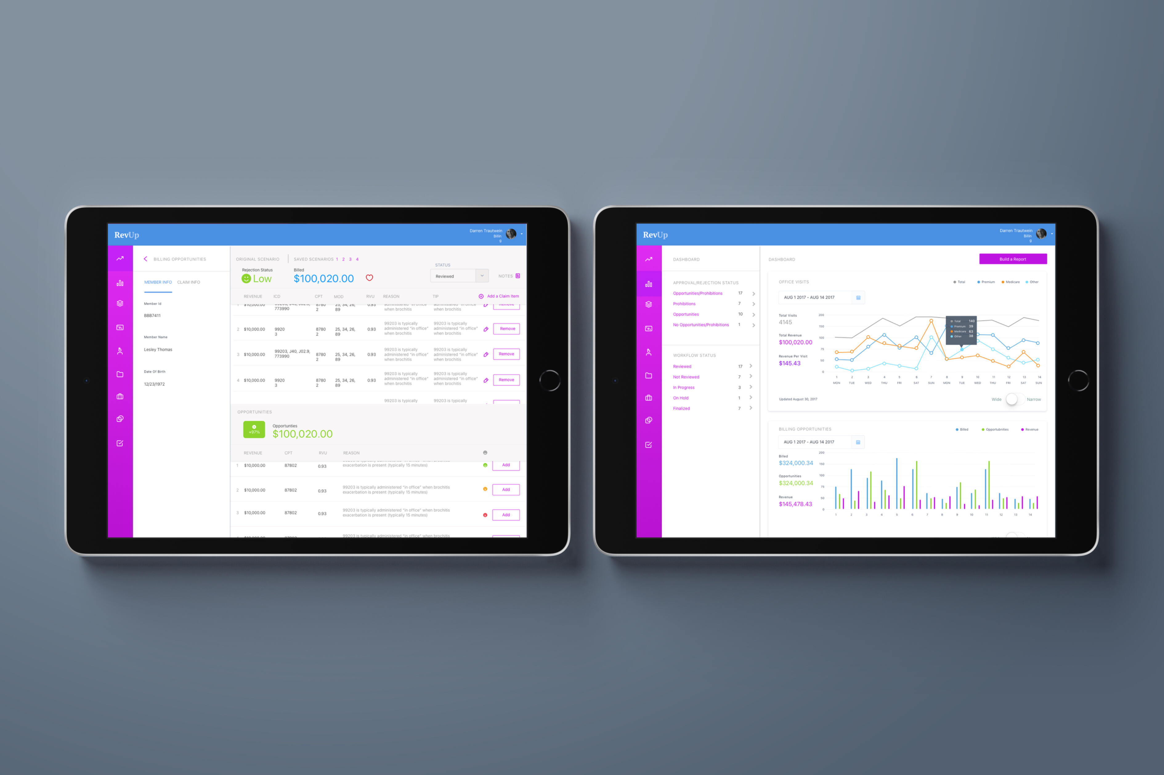
Healthcare billing teams needed a simpler way to manage complex revenue-cycle workflows, track encounters, identify billing opportunities, and turn large amounts of revenue data into actionable insights. Existing workflows made it difficult for billers, coders, and administrators to quickly understand what required attention.
2 — Solution
RevUp created a unified revenue-cycle platform with role-specific dashboards, configurable reporting, encounter-level status tracking, real-time alerts, and drill-down analytics. The experience transformed complex billing data into clear, actionable workflows that helped teams identify opportunities, manage claims, and make more informed revenue decisions.
PepsiCo — Enterprise Data Visualization
Client: PepsiCo
Product: Enterprise Data Visualization Platform
Role: UX Strategy & Product Design Lead
Category: Consumer Products • Enterprise Analytics
Experience: Enterprise UX • UX Strategy • Human-Centered Design • Information Architecture • Data Visualization
1 — Problem
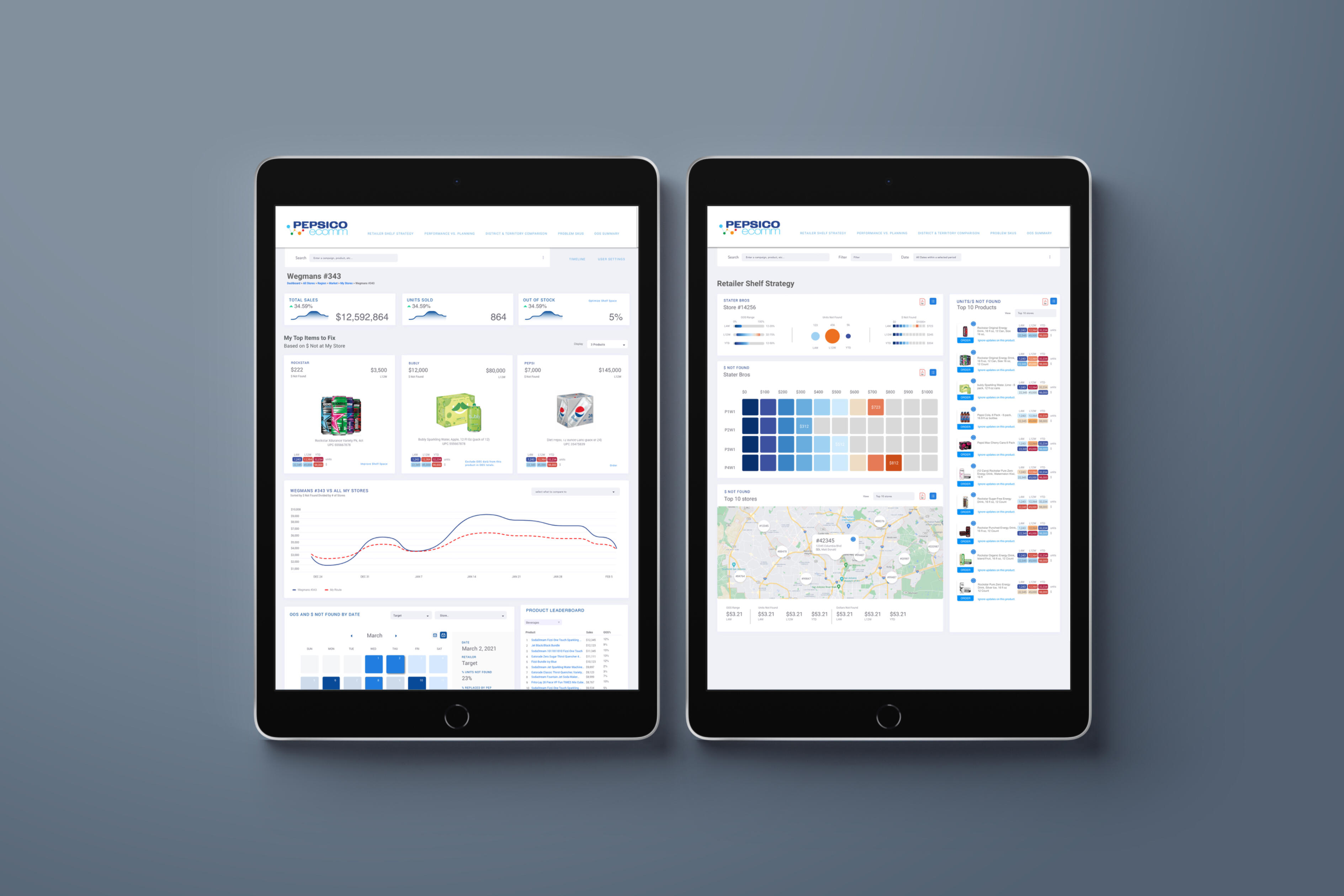
PepsiCo's executives, product managers, and field teams relied on fragmented systems and inconsistent data visualizations, making it difficult to translate large datasets into meaningful insights. Different roles also required very different levels of information, from executive summaries to detailed field-level data.
2 — Solution
A scalable data-visualization framework introduced consistent, story-driven information patterns and a structured information architecture. The experience provided executives with high-level insights while allowing operational teams to access deeper levels of detail, creating a more unified and actionable approach to enterprise decision-making
Biocanic
Client: Biocanic
Product: Functional Health Intelligence Platform
Role: UX Strategy & Product Design Lead
Category: Digital Health • Health Intelligence
Experience: Practitioner & Patient Digital Experience • UX Strategy • Human-Centered Design • Journey Design • Data Visualization
1 — Problem
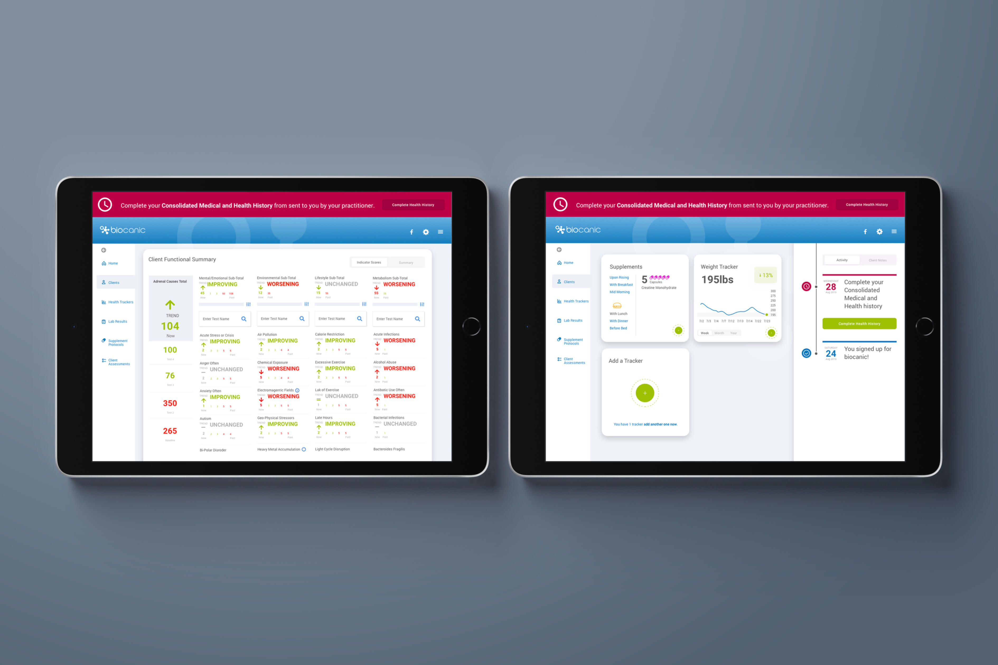
Functional and integrative health practitioners were managing complex health information across specialty labs, wearable devices, intake forms, and other disconnected sources. This fragmented ecosystem increased administrative work and made it difficult to transform large amounts of health data into personalized, actionable recommendations.
2 — Solution
Biocanic unified health data into a centralized intelligence platform that integrated data from more than 200 specialty labs and wearable platforms. Comprehensive dashboards, automated workflows, health tracking, customizable wellness programs, and AI-driven insights gave practitioners a consolidated view of each client while reducing administrative effort and supporting more personalized, data-driven care.
1 — LifeTrak | Zoom
Client: Salutron / LifeTrak
Product: LifeTrak Zoom HRV Wearable & Mobile Application
Role: UX Strategist & Art Director
Category: Digital Health • Wearable Technology
Experience: Consumer Health & Wellness Experience • UX Strategy • Human-Centered Design • Interaction Design • Behavioral Design
Problem
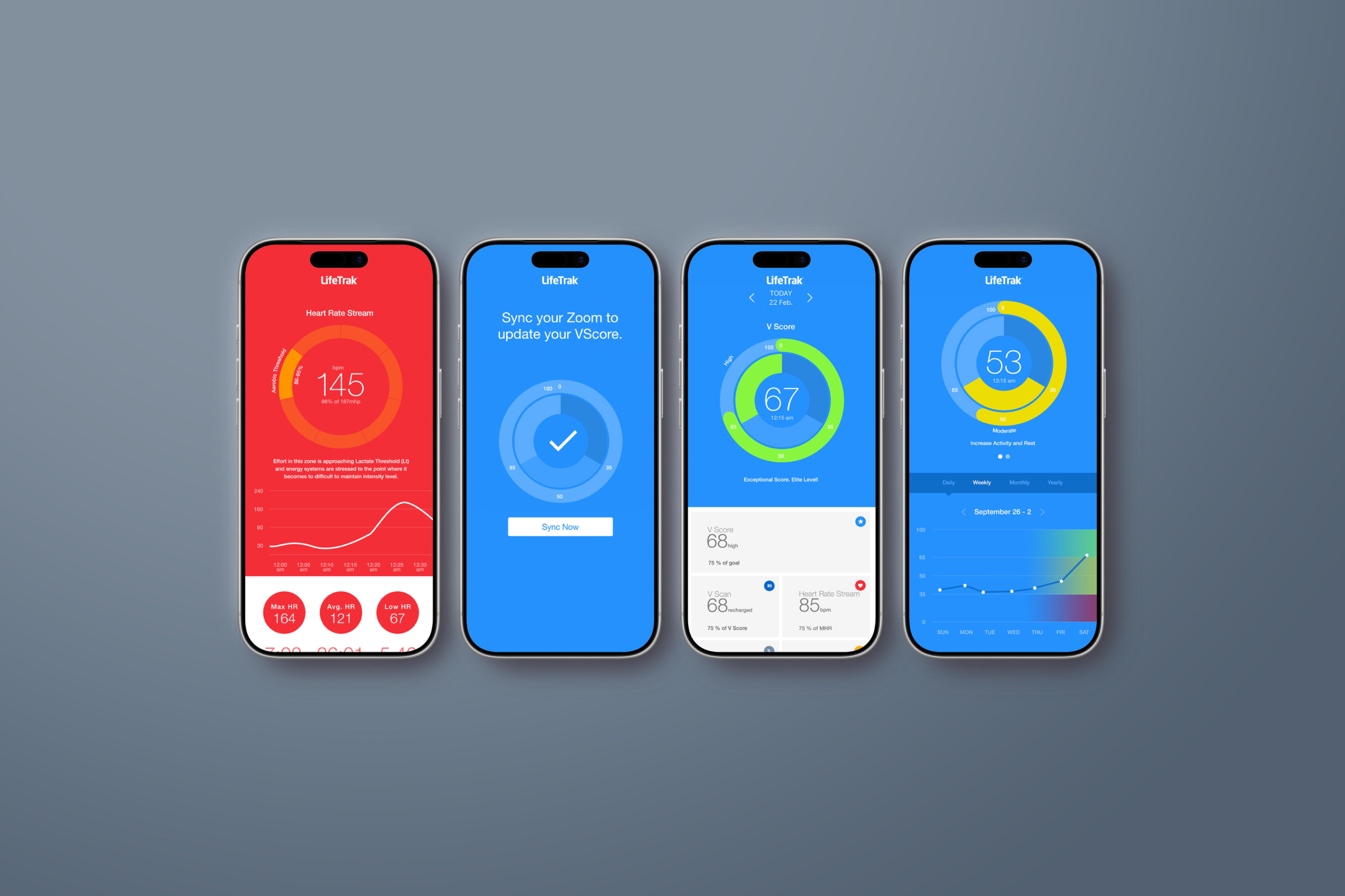
Traditional fitness trackers focused on steps, calories, and workouts but gave users little understanding of recovery, physiological readiness, stress, or when to train versus rest. Heart Rate Variability (HRV) offered valuable insight, but the science and raw biometric data were difficult for everyday users to understand and act upon
2 — Solution
LifeTrak Zoom transformed complex HRV, heart rate, sleep, recovery, and activity data into an intuitive personal recovery and readiness experience. VScore, on-demand VScan assessments, visual dashboards, trend analysis, and personalized guidance translated biometric data into clear insights that helped users understand their bodies, make smarter training and recovery decisions, and build healthier long-term habits.
Jurni
Client: Ascendium Education Group
Product: Jurni Student Success Platform
Role: UX Strategy & Product Design Lead
Category: Education Technology • Financial Wellness
Experience: Student Digital Experience • UX Strategy • Human-Centered Design • Journey Design • Behavioral Design
1 — Problem
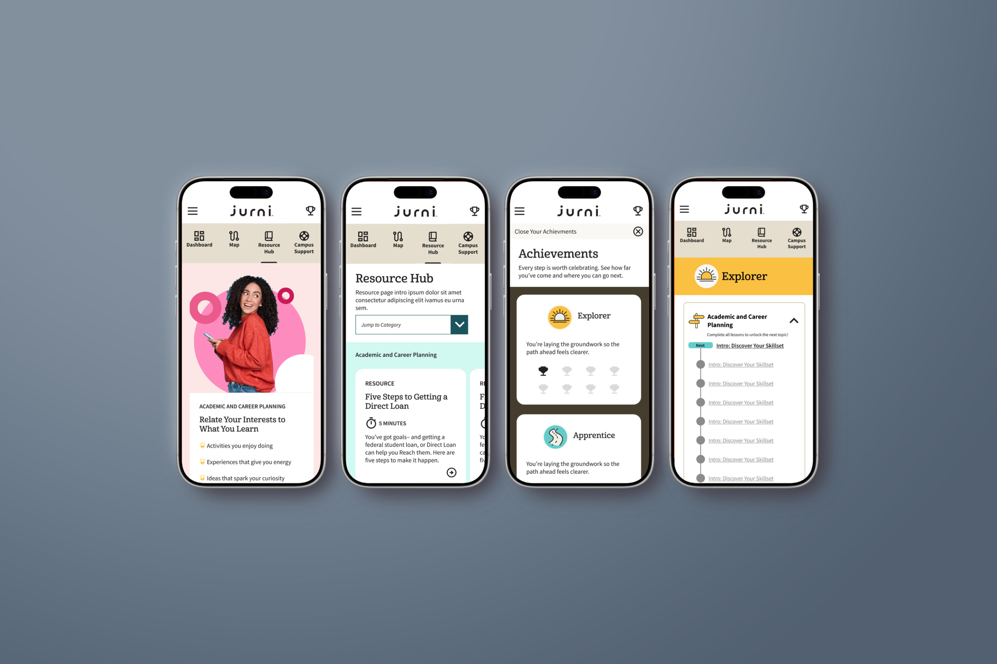
Students needed greater support navigating the financial challenges that can disrupt their education and lead to dropping out. At the same time, many students lacked the information and guidance needed to understand their student loans and prepare for repayment after leaving school.
2 — Solution
Jurni created a digital experience designed to support students throughout their educational journey—helping them stay enrolled while building greater awareness of their financial obligations. The platform connected education persistence with repayment preparation, giving students a clearer path toward completing their education and successfully managing student debt.
Merck | HR Portal
Client: Merck
Product: Employee HR & Development Experience
Role: UX Strategy & Experience Design Lead
Category: Enterprise Technology • Human Resources
Experience: Employee Digital Experience • UX Strategy • Human-Centered Design • Journey Design • Learning & Development Experience
1 — Problem
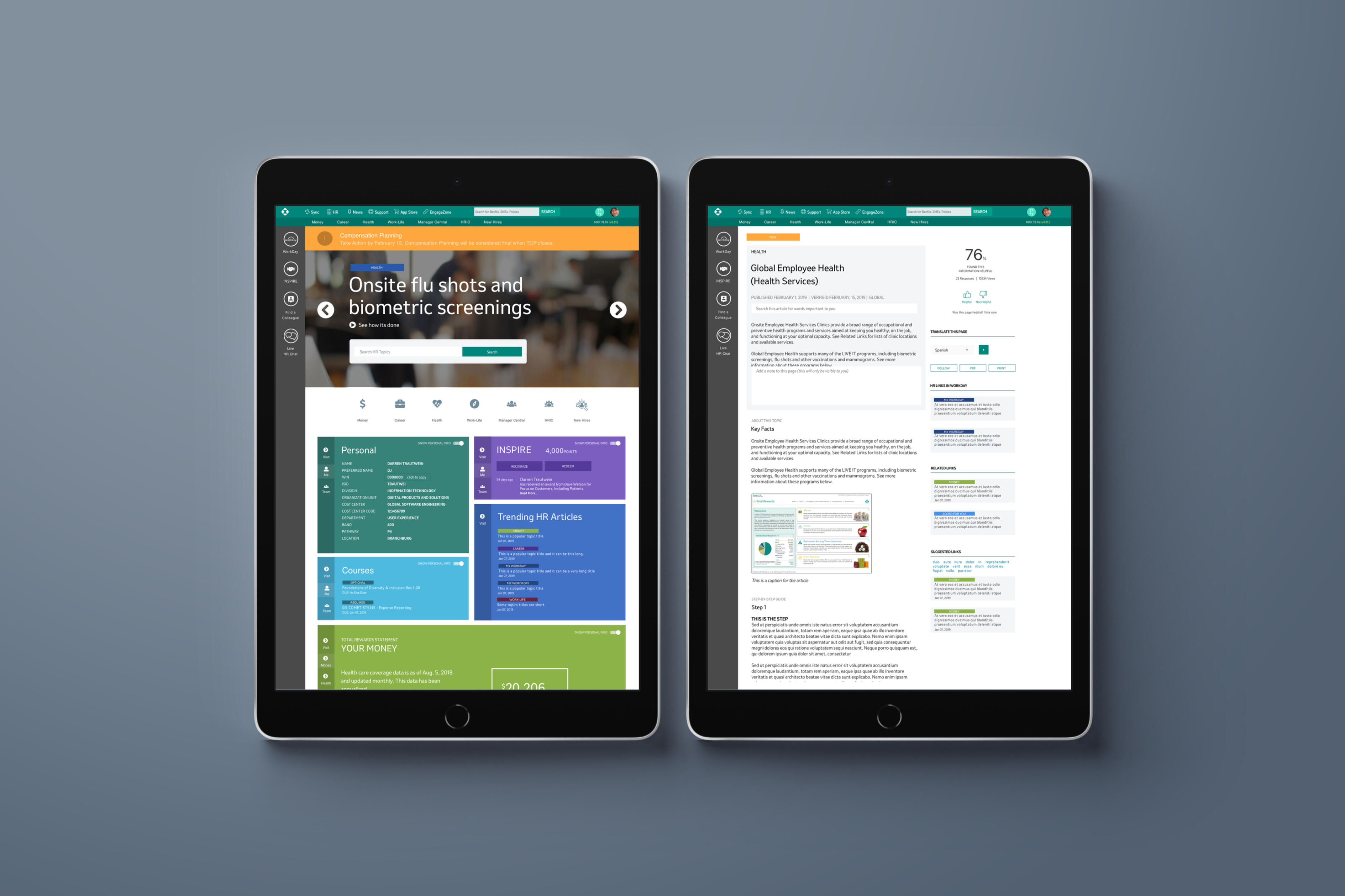
Merck employees needed a centralized, intuitive way to manage the many HR experiences that shape their relationship with the company—from salary and benefits to HR resources, programs, events, and company-wide communications. Information was distributed across different areas and presented inconsistently, making it harder for employees to find relevant information, understand available benefits and services, and stay informed about important HR initiatives. The lack of consistent content structures also created a fragmented employee experience across the HR ecosystem.
2 — Solution
The Merck HR Portal created a unified employee-facing digital experience that brought salary, benefits, HR services, resources, events, and communications into a centralized and intuitive destination. A standardized template-based publishing system was also developed to give HR content owners a consistent framework for creating and publishing information. By establishing common content structures, layouts, navigation patterns, and presentation standards, HR information was surfaced in a predictable and recognizable way—reducing cognitive load, improving findability, and creating a more cohesive employee experience across Merck.
Grade with Graipe
Client: Grade with Graipe
Product: AI-Powered Grading & Feedback Platform
Role: Product Design Lead • UX Strategy • AI Experience Design
Category: Education Technology • Artificial Intelligence • SaaS
Experience: AI Product Design • UX Strategy • Human-Centered Design • Design Thinking • Workflow Design • Interaction Design • Rapid Prototyping • Product Validation
1 — Problem
Transforming a Time-Consuming Grading Process with AITeachers spend significant time evaluating assignments, applying rubrics, maintaining consistency across student submissions, and creating meaningful individual feedback. The opportunity was to determine how AI could reduce this repetitive workload without removing teacher judgment or control from the grading process.Before investing in full product development, I used AI to rapidly create and test early concepts, validating whether generative AI could effectively evaluate student work against teacher-defined assignments and rubrics and generate relevant, actionable feedback. This approach helped validate the offering, identify limitations, and refine the product experience before moving into full design and development.
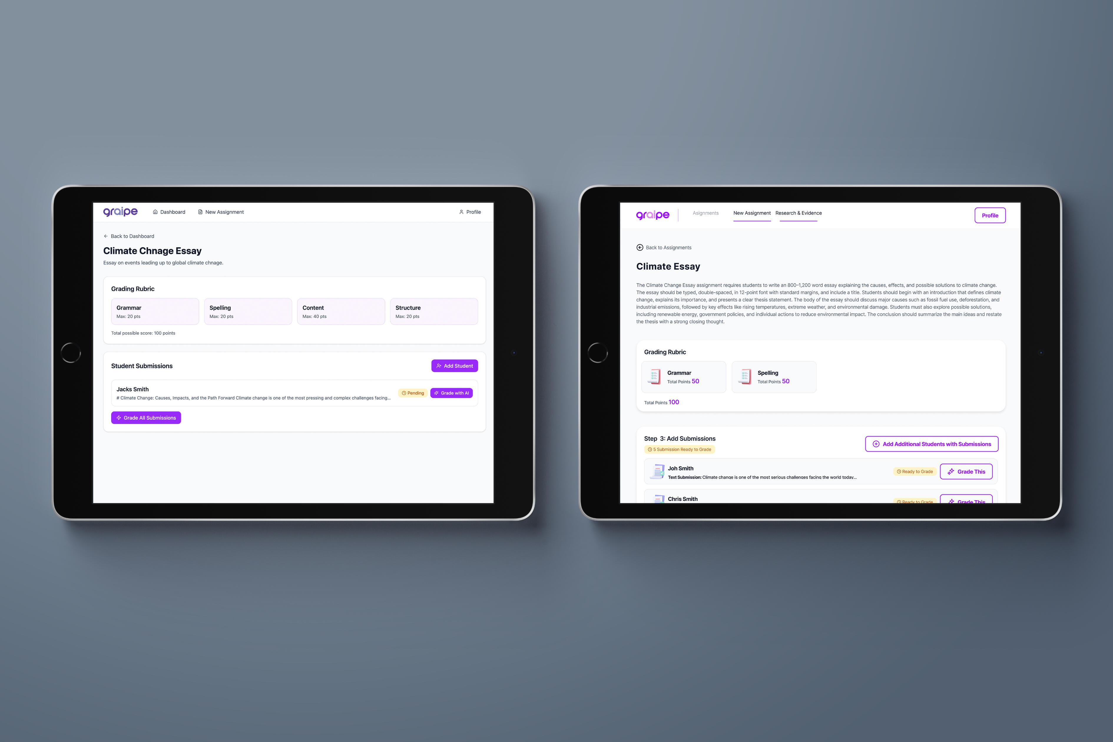
2 — Solution
An AI-Powered Grading Experience Built Around Teacher ControlGrade with Graipe was designed as a simple, human-centered AI grading platform that transforms a complex technology into a familiar teacher workflow:Define Assignment → Establish Rubric → Add Student Work → Grade with AI → Review Results.Teachers define the assignment and evaluation criteria while AI analyzes student work and generates structured grades, category-level assessments, and actionable feedback across areas such as Clarity of Ideas, Evidence and Support, Organization and Structure, and Language and Conventions.Rather than replacing the educator, Graipe uses AI to accelerate repetitive evaluation while keeping teacher expertise, oversight, and final judgment at the center of the experience. The initial AI-driven prototyping approach also enabled the concept to move rapidly from hypothesis → prototype → validation → product, reducing development risk before significant investment.